Minimalism
极简主义
Aliases:极简风简约风格性冷淡风大量留白那种设计性冷淡设计MinimalMinimalist DesignLess is more
What is it
A visual language built on "less is more": generous whitespace, a restrained monochrome palette and very few type scales let the content speak. All decoration is stripped away; hierarchy is created purely by space, weight and rhythm. Quiet, restrained, content-first.
Design spec
Typography
Serif display with grey sans body
Color
Off-white #FAFAF8 × near-black #161513, one accent
Border
Frameless; 1px #EDEDE9 hairlines at most
Shadow
No shadows — depth via greyscale
Spacing
Generous whitespace on a relaxed 8pt grid
Motion
Colours and opacity only, under 150ms, no movement
States
Hover changes colour only; focus shows a black hairline ring; active darkens slightly; disabled drops to 40% opacity; error uses a single red
Style in action
See the full page, then try the interactive sceneFull-page preview
MAKE SPACE FOR EVERYDAY FOCUS
A calmer
digital life
Simple tools. A more focused you.
Explore Lumo →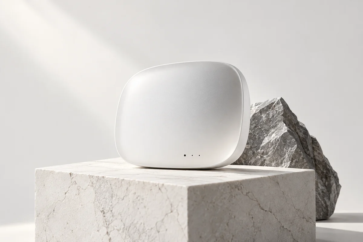
Less distraction
More living
Interactive scene
Loading demo…
✓ When to use
- Content-first products — reading, writing, photography, portfolios
- Conveying a professional, restrained, premium brand voice
- Pages with few elements and clear structure (hero, detail pages)
✕ When not to use
- Dense dashboards — excessive whitespace wastes efficiency
- Marketing or festive contexts that need energy and warmth
- Without strong typographic skill it reads as empty rather than elegant
Variants
Monochrome Minimal
黑白极简
Pure black, white and grey — the sharpest version
Flat Minimal
扁平极简
No shadows or gradients; hierarchy via whitespace and weight
Warm Minimal
暖调极简
Cream and warm-grey tones, Japanese or Nordic feel
Implementation
whitespacefont-weightletter-spacingborder: 1px solidgridTypography and whitespace carry the design: at most three type sizes with restrained line-height; a palette of black, white, grey plus at most one accent; separate with 1px hairlines or pure space instead of boxes; buttons are solid black or outlined, no shadows or gradients. Remove everything first, then refine what remains.
Agent prompts
Four prompt layers run from “what it is” all the way to a ready-to-run task. On the Agent task layer you can stack a visual style and extra requirements, then copy it to your coding agent in one click.
Implement a minimal content card section in Minimalism style in the current project.

Inspect the existing design tokens and component system first; reuse the current font and spacing variables.
Requirements:
- Generous whitespace; hierarchy from type scale, weight and space only
- Palette restrained to black, white, grey plus at most one accent
- No shadows, gradients or textures; separate with 1px hairlines or whitespace
- Dark mode support
- If any transitions are added, respect prefers-reduced-motion and keep them under 150ms
- No new dependencies
Run existing project checks when done and list the modified files.

Additional requirements:
- Dark mode support
- Respect prefers-reduced-motion
- No new dependencies
- Run existing checks and list modified files
Hand to your coding agent — stack a style and extra requirements on top
Related concepts
A visual language that strips out all simulation: solid color blocks, simple geometry, no gradients, shadows or textures. Hierarchy comes from color, shape and typography alone. The opposite of skeuomorphism — the interface admits it is a glowing plane and trades decoration for clarity.
StylesSimilarA visual language of objective grids and typography: strict mathematical grids, sans-serif faces, flush-left setting, black and white plus one accent (classically red). Order comes from whitespace and type scale. Decoration is noise; the goal is information read along the shortest path.
StylesSimilarA visual language that lays out the page like a magazine spread: serif display headings, drop caps, hairline column rules, issue numbering and generous margins, with imagery woven into a page-turning rhythm. Black, white and grey grounds, serif-and-sans pairing — the layout tells the story, not ornament.
StylesSimilarA clickable block that triggers one clear action — the most basic interactive element of any interface. Fill, outline and ghost styles rank primary against secondary actions; presses give instant sink-in feedback, and a busy state disables further clicks to prevent double submission.
ComponentsAffectsA self-contained rectangular container outlined by rounded borders or a surface colour, aggregating related content: cover, title, excerpt and actions. The universal display unit of content feeds, dashboards and commerce lists.
ComponentsAffects