A FIELD GUIDE TO DIGITAL INTERFACES
Discover the design.
Understand the details.
From “what is that called?” to “I can build that.” Explore visual styles, try real components and turn inspiration into your next creation.
Try: "grey shimmering while loading" or "Mac-style quick search box"
165 concepts · 7 types · 中 / EN
Discover
Find an idea by style, component or plain language.
Explore
Try forms and sizes through real interactions.
Build
Bring the guidance and prompts into your own project.
Start with what you want to do
No vocabulary required. Follow a task, try the details, then take the brief with you.
Connect navigation, data and actions into a clear daily workflow.
Open the curated path →02 / START HEREMake a form easier to completeTry input, validation, failure and recovery to see how components form a complete flow.
Open the curated path →03 / START HEREName what you see in a screenshotSeparate structure from effects, then use numbered examples to name the parts you want to borrow.
Open the curated path →A FIELD GUIDE TO VISUAL LANGUAGES
Start with a style
10 studies from 25 visual languages. See the composition, then open the interactive demo.
MAKE SPACE FOR EVERYDAY FOCUS
A calmer
digital life
Simple tools. A more focused you.
Explore Lumo →
Less distraction
More living
Minimalism极简主义
IDEAS
BUILD
TOMORROW/
Design for
a better future.
An independent studio for brands and digital experiences. Strategy, design and technology for what comes next.
Explore work →DESIGN
FOR A
BRIGHTER
TOMORROW.
VERTEX STUDIO
Swiss Style瑞士风格
Good Life
in Small Things
A little room for the everyday.
Stories of people, places and the rituals that make an ordinary day feel extraordinary.
Read the journal →
Life is here,
in the little things.

Slow down with the morning light
A fresh look at familiar streets

Finding your own rhythm
Editorial杂志编辑风

Let your ideas
flow naturally.
A new home for creative thinking.
Less distance between idea and reality.
Find a spark. Make it yours.
Your ideas, wherever you are.
Fits the way you create.
Good ideas
deserve to be seen.
A brighter tomorrow.
Glassmorphism玻璃拟态
A little order.
A better day.
Tasks, notes and plans, together. Make room for what matters in your day.
Get started →
a little further.Keep going →
Bento Grid便当盒网格
Make focus
a daily ritual.
Simple tools. A quieter experience.
More time for the things that matter.
A lovely day ahead.
Take a little breath.
Neumorphism新拟态
Good things.
A life well lived.
Honest materials. Objects with warmth.
Design that only gets better with time.
in the real details.
Skeuomorphism拟物化
GOOD
IDEAS
NO LIMITS.
We are an independent creative studio.
Brands, digital experiences, experiments.
Design beyond the expected.
DESIGN
FOR A MORE
OPEN WORLD.
IDEAS
PEOPLE
CULTURE
Brutalism粗野主义
Good ideas
make a brighter world.
We bring design, content and code together
to make brands feel a little more human.
Design.
More Fun!⤴
IDEAS
MAKE A
BRIGHTER
TOMORROW.
☑ Design
☑ Develop
☑ Create
TogetherEXPLORE
BELONG
Neobrutalism新粗野主义
A small corner of the early internet.
Interesting pages, favourite links and stories worth a slower look.
YOU ARE VISITOR 0 0 1 2 8 4
A simpler internet.
A brighter tomorrow.
Retro Web复古互联网
FRESH IN THE ATLAS
Six more pieces of a complete interface
A text field paired with a list of suggestions. People type to narrow a set, then commit a value with pointer or keyboard. Typed text, the active suggestion and the committed selection are separate states. Provide a clear empty result and a way to clear the field when nothing matches.
ComponentsA form region for selecting files, checking constraints and managing a pending list. It may use a native picker or a drop zone, but drag-and-drop must have a picker alternative. Selection is not upload completion: distinguish pending, processing, success and failure, and explain accepted types and size limits.
ComponentsAn input for a bounded subjective score, often represented by stars or labeled satisfaction levels. Hover previews a value; pointer or keyboard selection commits it. Give each level a text meaning, distinguish no rating from the lowest score, and label read-only averages and their sample counts clearly.
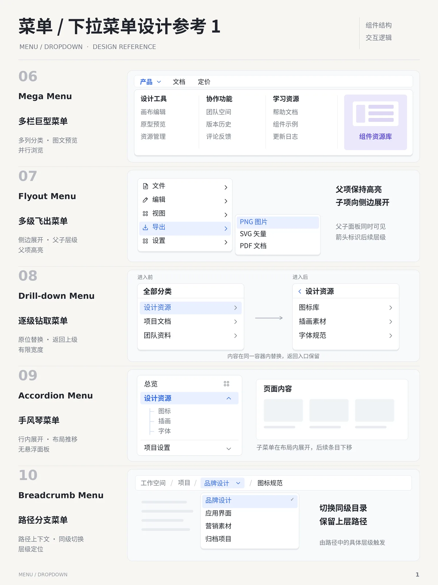
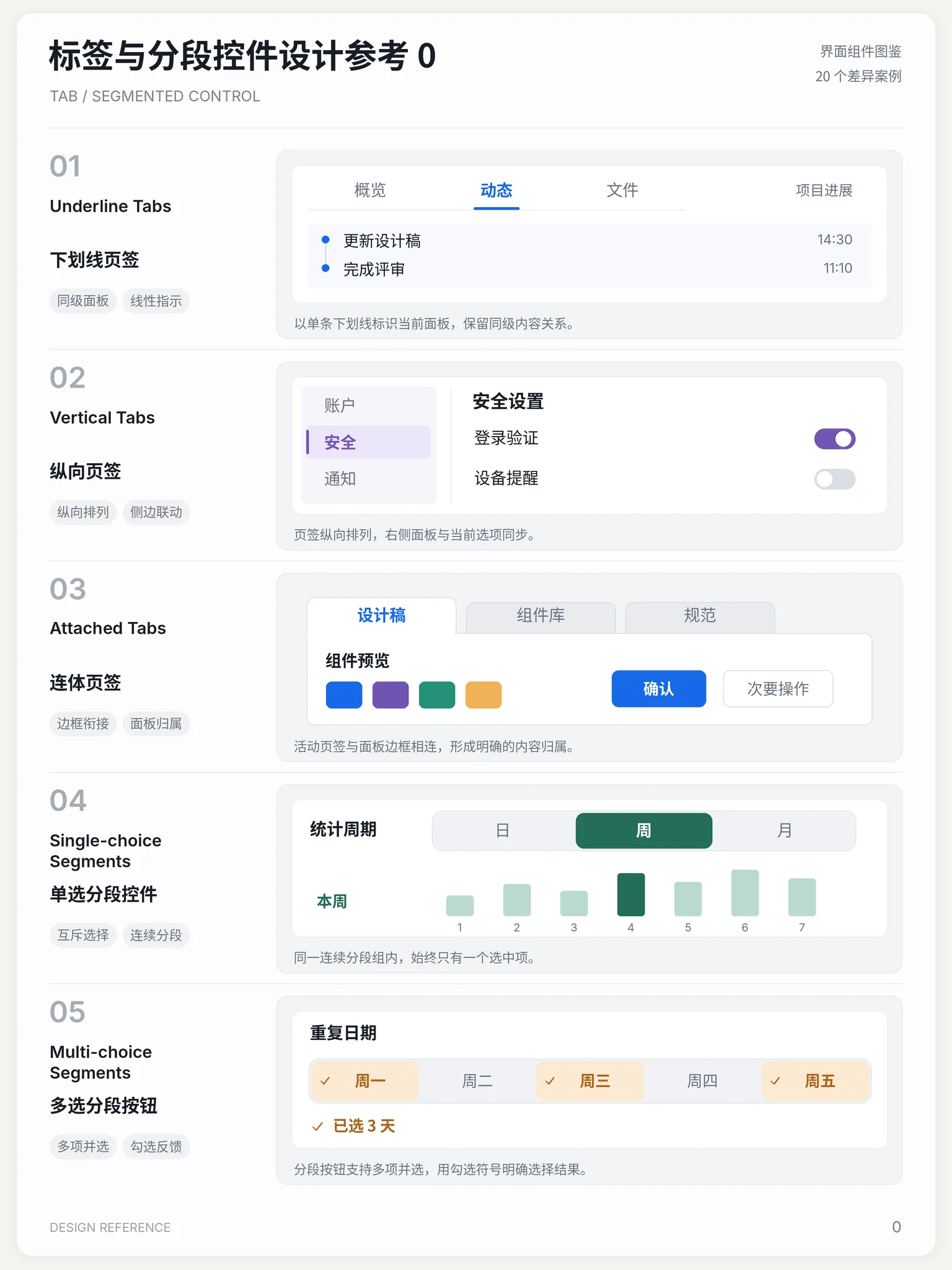
ComponentsA compact group of mutually exclusive choices with an immediately visible selection. Use it to change a time range or display mode within the same view. Keep labels short and all choices visible. Unlike tabs, it usually changes how the current content is presented rather than moving between separate panels.
ComponentsAn ordered progress indicator that explains the stages of a task, the current step and completed work. Pair it with a multi-step form to make a long task easier to understand. Validate before advancing, preserve values when going back, and keep progress indication distinct from the controls that move the flow forward.
ComponentsA display that orders events by time, using timestamps, markers and content to explain sequence. It works for activity logs, project journals or order history. Unlike a stepper, which emphasizes task stages to complete, a timeline tells an event story. Keep titles and times visible when details expand.
ComponentsExplore by type
Gallery
View all →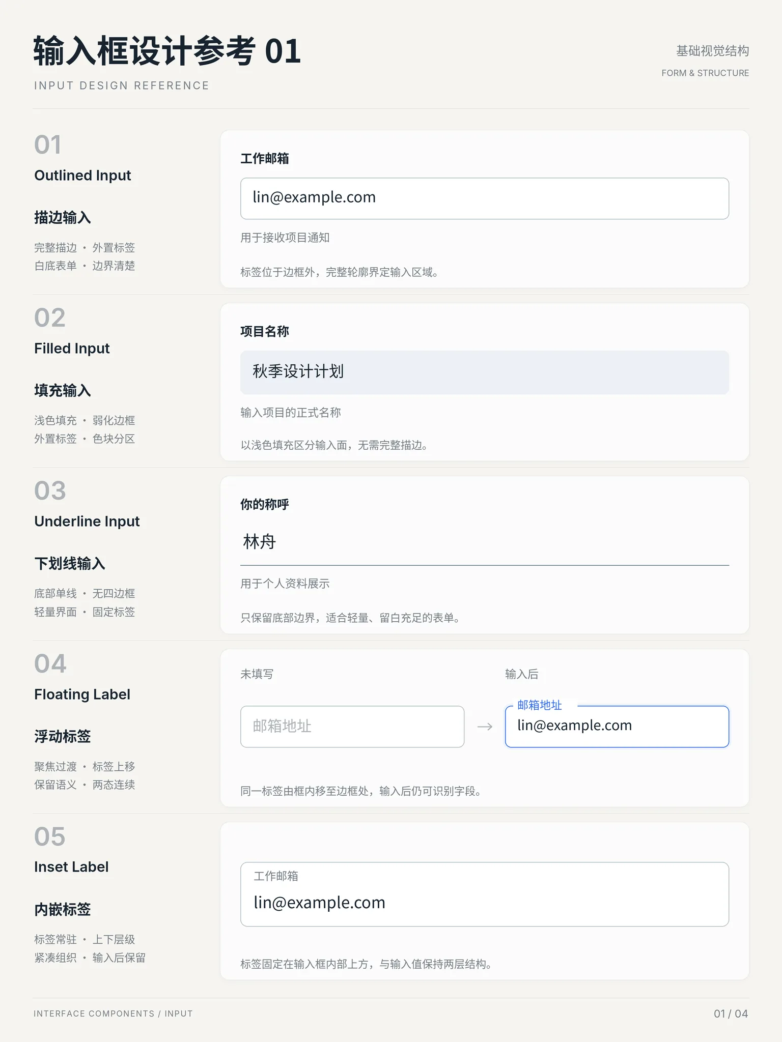
Popular concepts
A layout language that packs the interface like a bento box: rounded tiles of varying spans snap to one grid with narrow gutters — big cells carry the hero content, small cells hold stats and garnish. A card-grid upgrade where area itself encodes priority.
StylesA visual language that expresses floating layers as frosted glass: a blurred backdrop (backdrop-filter), a low-opacity fill and a thin white rim of light. Panels literally reveal the vivid background beneath them, so the style is about depth — it only works over rich, colorful content worth revealing.
StylesA loud visual language of thick black outlines, saturated clashing colors and hard offset shadows: elements sit on the page like bold stickers, paired with chunky radii and punchy badges. It deliberately rejects polish and subtlety, trading refinement for instant recognition and a rebellious, playful voice.
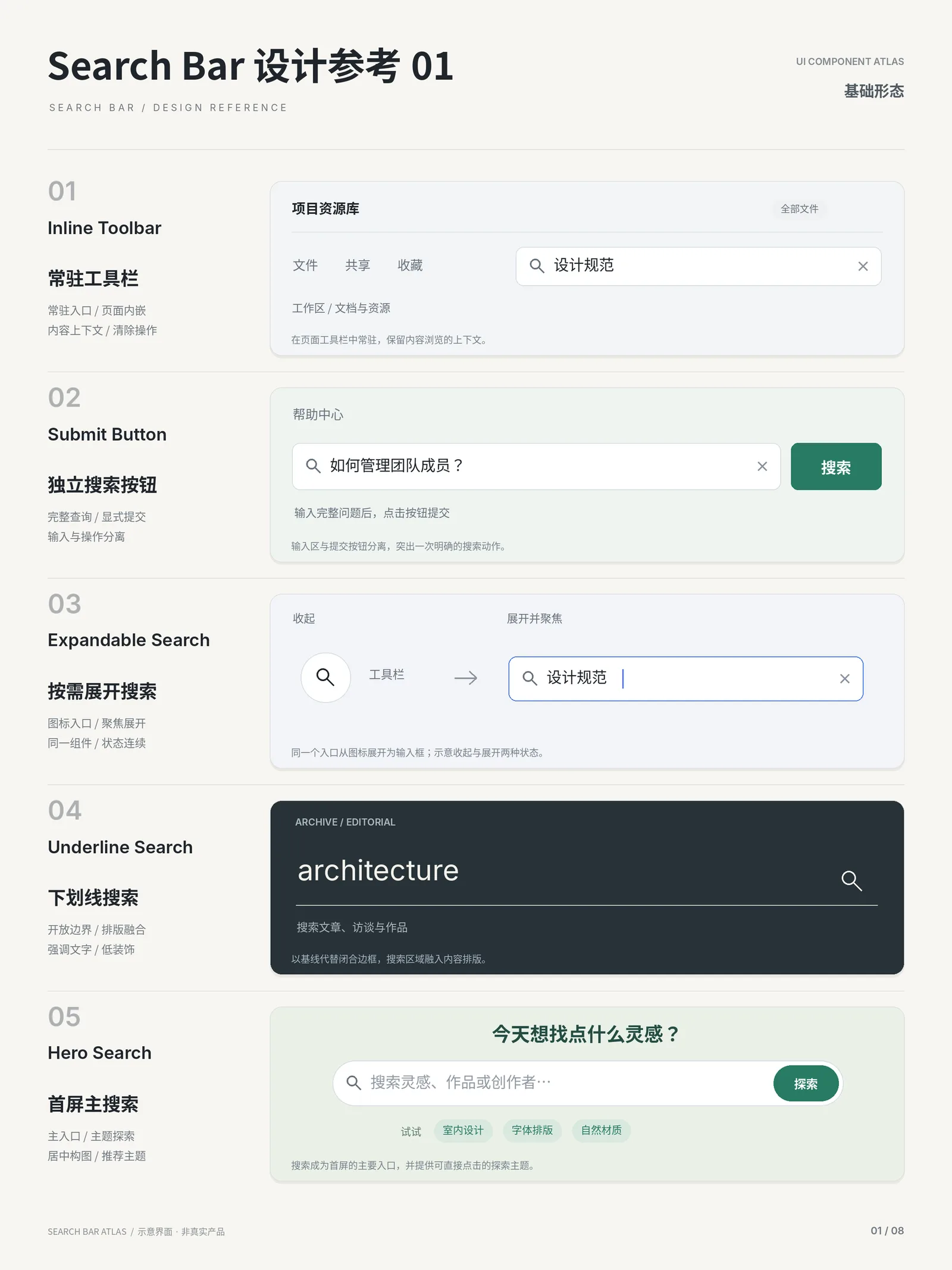
StylesA floating search panel summoned with ⌘K / Ctrl+K: type to filter commands, pages or content, navigate with arrow keys, execute with Enter. Popularized by macOS Spotlight; now standard in power-user products.
ComponentsGrey placeholder blocks that mirror the real content structure while loading, usually with a subtle shimmer or pulse. It tells users "content is coming and it will look like this" instead of a blank page or a bare spinner.
PatternsElements stay hidden until they enter the viewport, then play a fade, rise or slide-in — once. It replaces "dump everything at once" with content revealed at the pace of reading, giving long pages a sense of order. Usually triggered by IntersectionObserver.
Motion