Command Palette
命令面板
Aliases:命令搜索框快捷搜索框快速操作面板spotlight 搜索ctrl+k 搜索Mac 那种快捷搜索框cmd+k
What is it
A floating search panel summoned with ⌘K / Ctrl+K: type to filter commands, pages or content, navigate with arrow keys, execute with Enter. Popularized by macOS Spotlight; now standard in power-user products.
Interactive playground
Try it. Make an informed choice.Open the palette, type a query, select a command and dismiss it.
Loading lab…
What to look for
- 01Search command aliases and explain empty results.
- 02Return focus to the trigger after closing.
From reference to practice
AI-generated visual references · Open the full collection
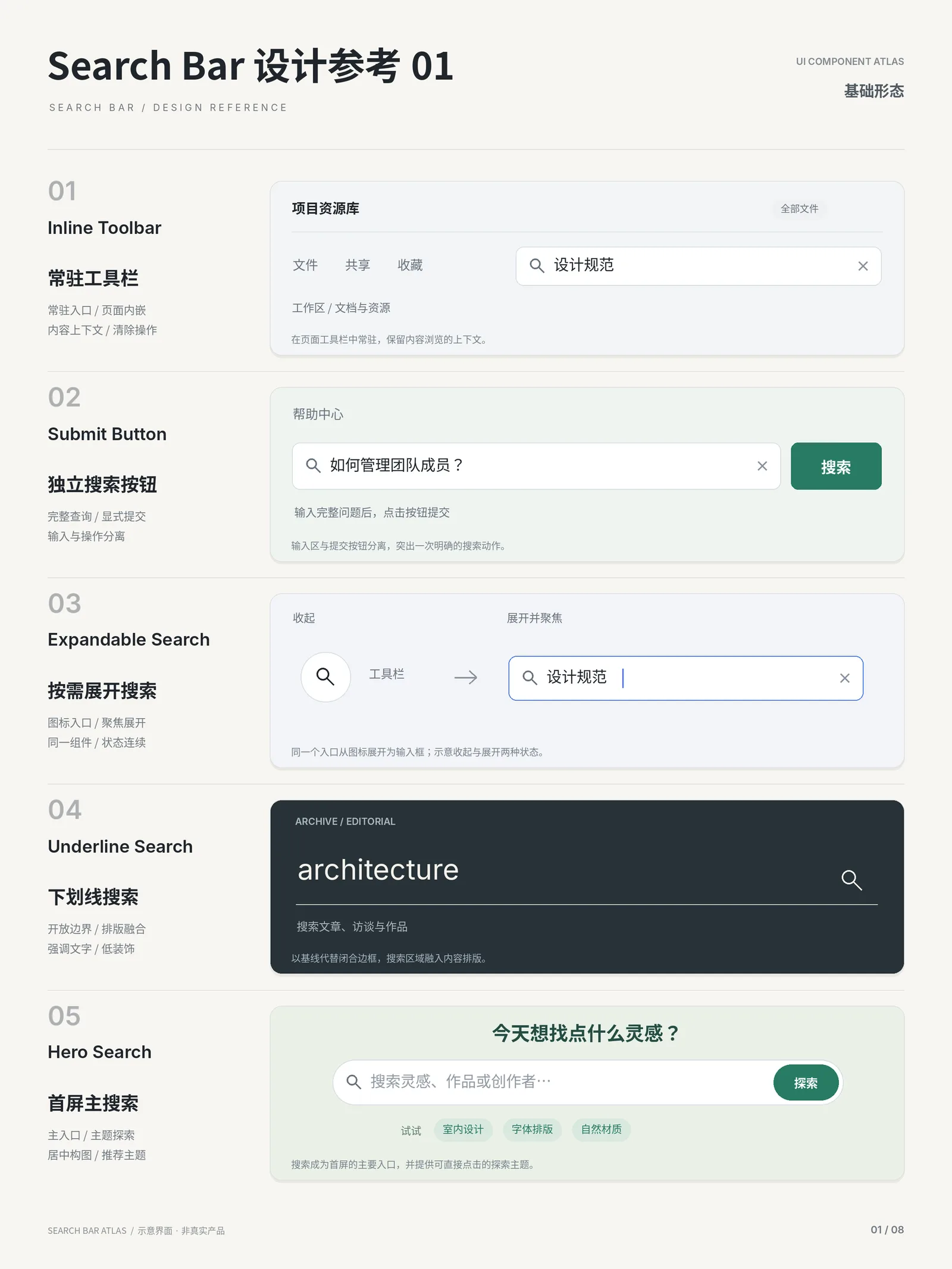
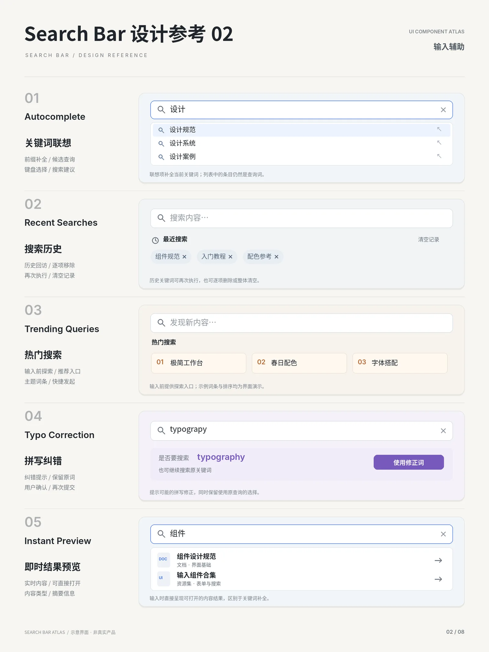
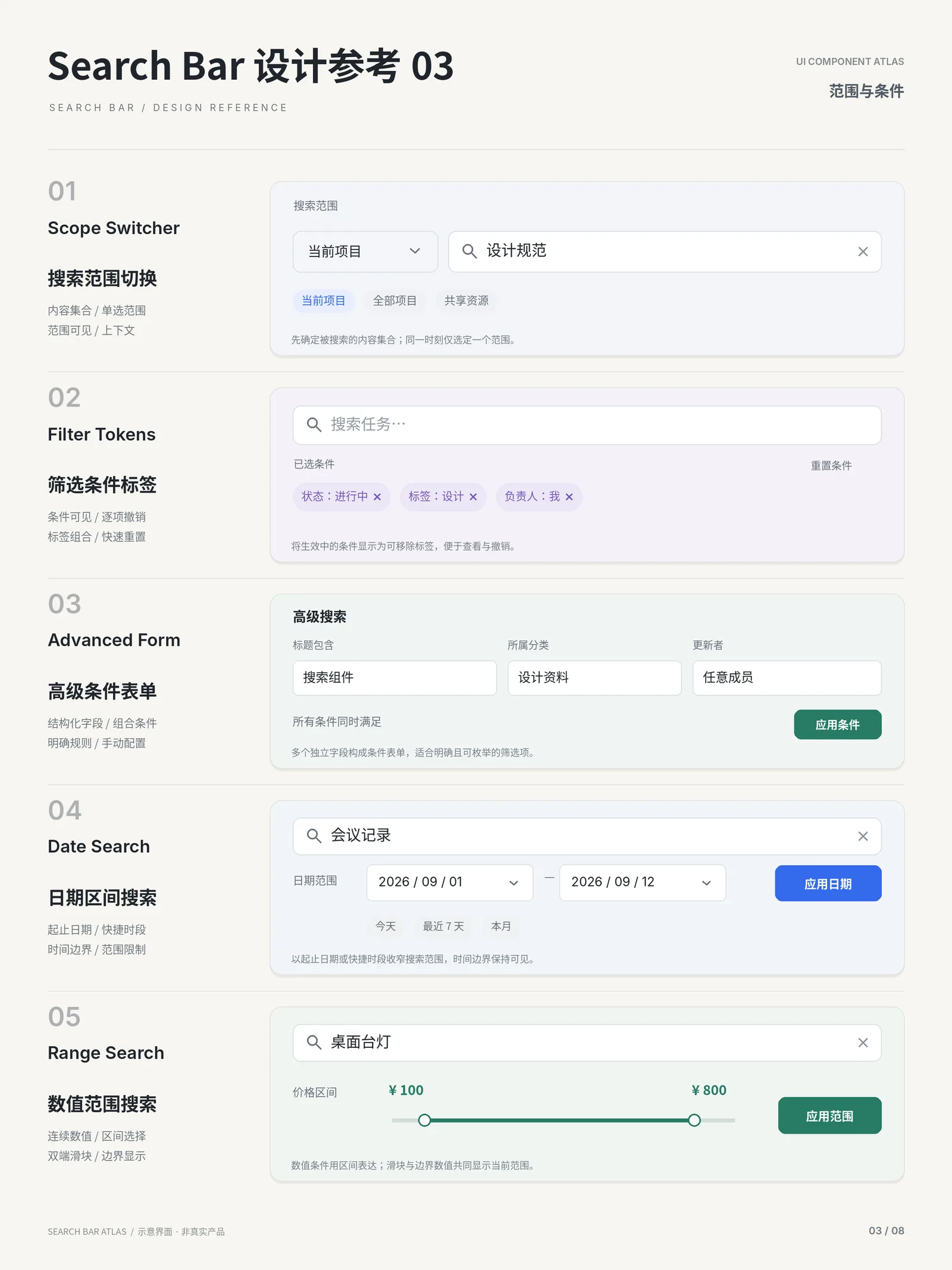
✓ When to use
- Products with many features and deep hierarchies — admin panels, dev tools, note apps
- Power users performing frequent actions
- When you want flat navigation — reach anything in one stroke
✕ When not to use
- Mass-market shallow apps — users don't know the shortcut culture
- Mobile-primary contexts — use a bottom search instead
- Very few commands (< 10) — a plain menu suffices
Variants
Command-only
纯命令
Commands only — VS Code style
Universal
万能搜索
Commands, pages, content and recents
AI-enhanced
AI 增强
Natural language queries with suggested actions
Implementation
position: fixedbackdrop-filter: blurbox-shadowtransform-originA controlled overlay: fixed centered + blurred backdrop; filter with useMemo into grouped lists; keep focus locked in the input; manage activeIndex for keyboard nav. The cmdk library is a solid React reference. Use role="dialog" and a focus trap.
Platform API
<dialog>role="combobox"Compare
Full comparison →| Command Palette命令面板 | Dropdown下拉菜单 | |
|---|---|---|
| Interruption | Medium — covers screen but closes fast | Low — a small panel near the trigger |
| Content capacity | Medium — virtualizable list | Low to medium — a few to a dozen items |
| Trigger cost | Low — one shortcut | Low — a single click |
Related concepts
A content-discovery page answering a query: a persistent search box on top (keeping the term, editable to re-search), type and facet filters on one side, and results ranked by relevance in the body (title + snippet + highlighted hits), continued by pagination or infinite scroll. Empty state and no-results state must be designed explicitly.
PagesUsed withA menu of actions popping near its trigger to tuck away secondary operations and keep the interface tidy — the classic form being a "···" more button. The panel floats over content with a shadow; picking an item executes and closes, and destructive actions sit isolated below a divider in red.
ComponentsAlternativeA vertical navigation area pinned to one side of the page (usually the left), carrying the primary hierarchy of a product. The de facto standard of admin systems: brand and global search on top, module tree in the sidebar, content focused on the task.
ComponentsSimilarA temporary overlay listing actions, opened by click or right-click: flat or grouped command items that execute and close on selection. It houses infrequent actions (more, settings, delete), usually behind a "⋯" button or a context click.
ComponentsSimilar