Dropdown
下拉菜单
Aliases:下拉菜单下拉选项更多菜单操作菜单溢出菜单三个点菜单
What is it
A menu of actions popping near its trigger to tuck away secondary operations and keep the interface tidy — the classic form being a "···" more button. The panel floats over content with a shadow; picking an item executes and closes, and destructive actions sit isolated below a divider in red.
Name disambiguation
A dropdown pairs a trigger button with a popup menu. A Select is a form-value control. A Popover can hold arbitrary content, not only commands.
Interactive playground
Try it. Make an informed choice.Open the action menu, navigate with arrows, rename or delete, then undo.
Loading lab…
What to look for
- 01Close after an action and return focus to the trigger.
- 02Make deletion confirmation and recovery clear.
From reference to practice
AI-generated visual references · Open the full collection
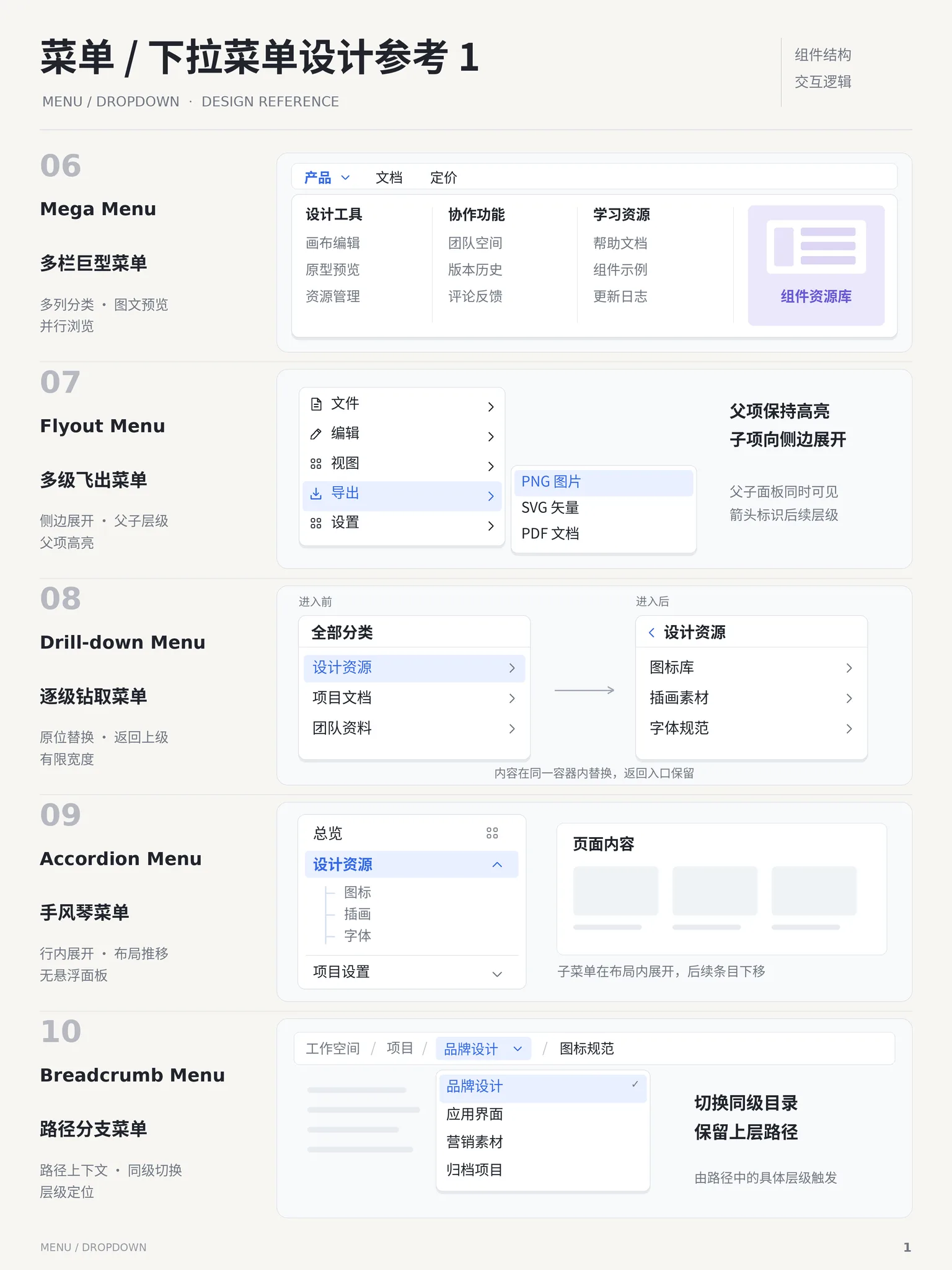
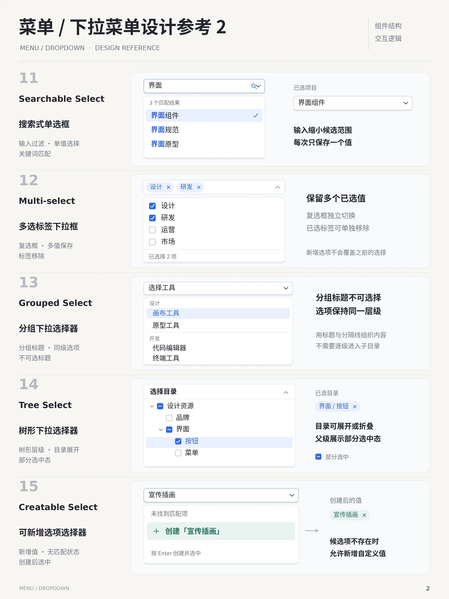
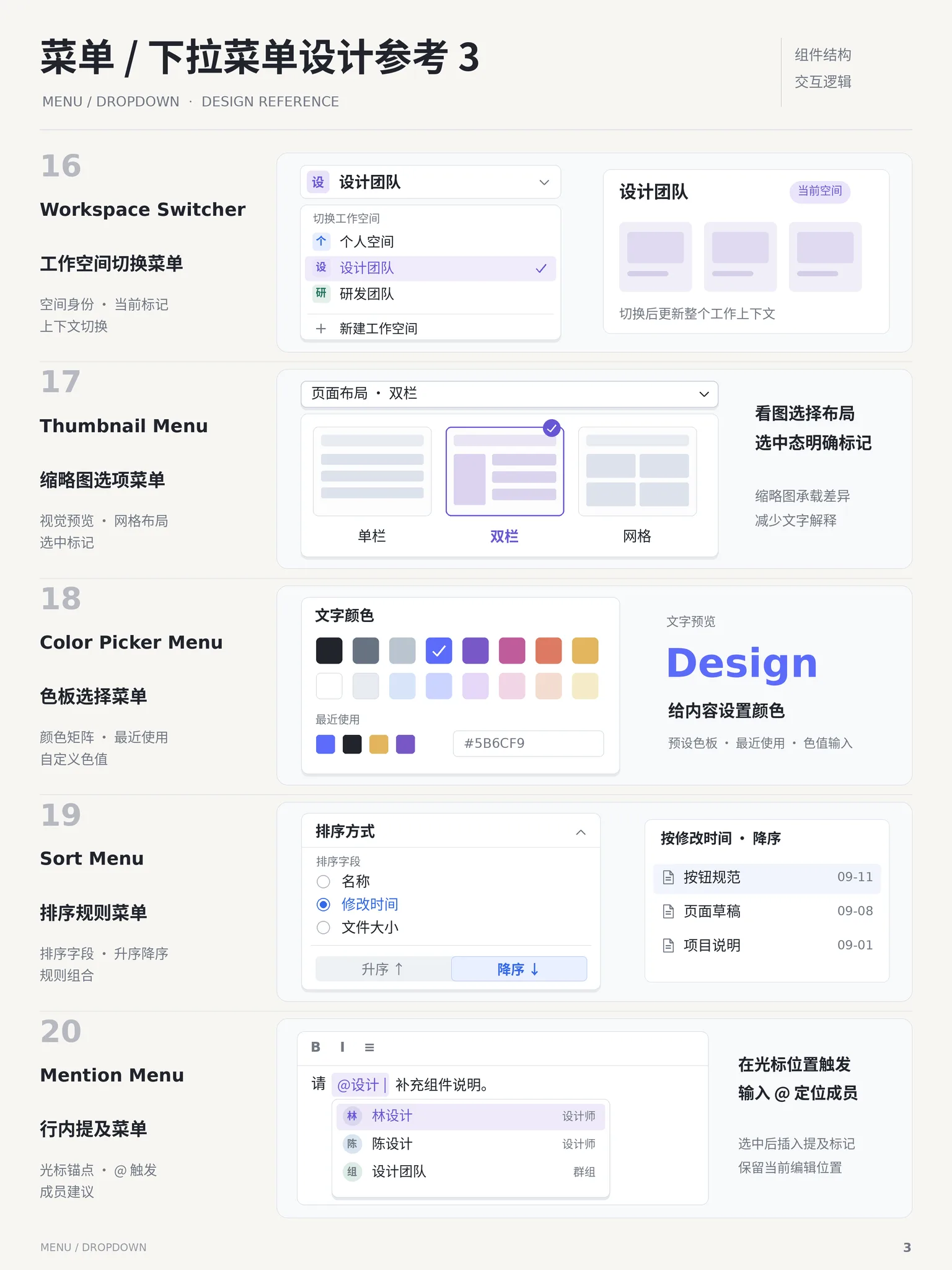
✓ When to use
- Secondary actions do not warrant permanent visibility
- Row-level actions collected behind a "···" button
- Toolbar space is tight and actions must fold up
✕ When not to use
- Frequent primary actions deserve real buttons
- Picking a value for a form — use a select instead
- Nested menus beyond one level on touch — use a drawer or page
Variants
More button
更多按钮
Row actions behind a "···" trigger
Hover
悬停展开
Opens on pointer hover — desktop navigation
With icons & divider
带图标与分隔
Icons aid scanning; a divider isolates the danger item
Implementation
position: absolutez-index: 10box-shadowtransitionAbsolutely position the panel below the trigger with a subtle opacity + translateY transition (durations multiplied by --demo-speed). Mark up with role="menu" and role="menuitem"; arrow keys move, Escape and outside click close. Isolate the danger item below a divider in red to prevent misclicks, and keep the trigger highlighted while open.
Platform API
role="menu"role="menuitem"aria-haspopupIn code
The exact names this thing goes by in each ecosystem — use the row that matches your project.
| Framework | Name |
|---|---|
| ARIA APG | Menu Button |
| shadcn/ui | DropdownMenu |
| MUI | Menu |
| AntD | Dropdown |
Compare
Full comparison →| Dropdown下拉菜单 | Command Palette命令面板 | |
|---|---|---|
| Interruption | Low — a small panel near the trigger | Medium — covers screen but closes fast |
| Content capacity | Low to medium — a few to a dozen items | Medium — virtualizable list |
| Trigger cost | Low — a single click | Low — one shortcut |
Related concepts
A temporary overlay listing actions, opened by click or right-click: flat or grouped command items that execute and close on selection. It houses infrequent actions (more, settings, delete), usually behind a "⋯" button or a context click.
ComponentsSimilarA non-modal layer that pops up beside its trigger on click, carrying medium-complex content such as text, a mini-form or a date picker. No backdrop and no blocking of the rest of the page; clicking outside or pressing Esc closes it.
ComponentsSimilarA floating search panel summoned with ⌘K / Ctrl+K: type to filter commands, pages or content, navigate with arrow keys, execute with Enter. Popularized by macOS Spotlight; now standard in power-user products.
ComponentsAlternativeA collapsed single-line control holding a set of mutually exclusive options; expanding the panel reveals them and the chosen value stays on the trigger. More space-efficient than radios, suited to more than 5 options; the panel can scroll, group or search, and picking one closes it.
ComponentsSimilarA dialog rendered above the page with a translucent backdrop that interrupts the current flow and demands a task or decision first. The backdrop blocks interaction with the underlying page and focus is temporarily trapped inside — the most disruptive of the overlay containers.
ComponentsSimilarNot to be confused with
Menu is just the popup list; Dropdown includes trigger and dismiss logic.
Select collects form values; Dropdown runs commands.
Popover content is free-form; a dropdown list is command items.