Menu & Dropdown Reference Sheets
菜单与下拉参考图集
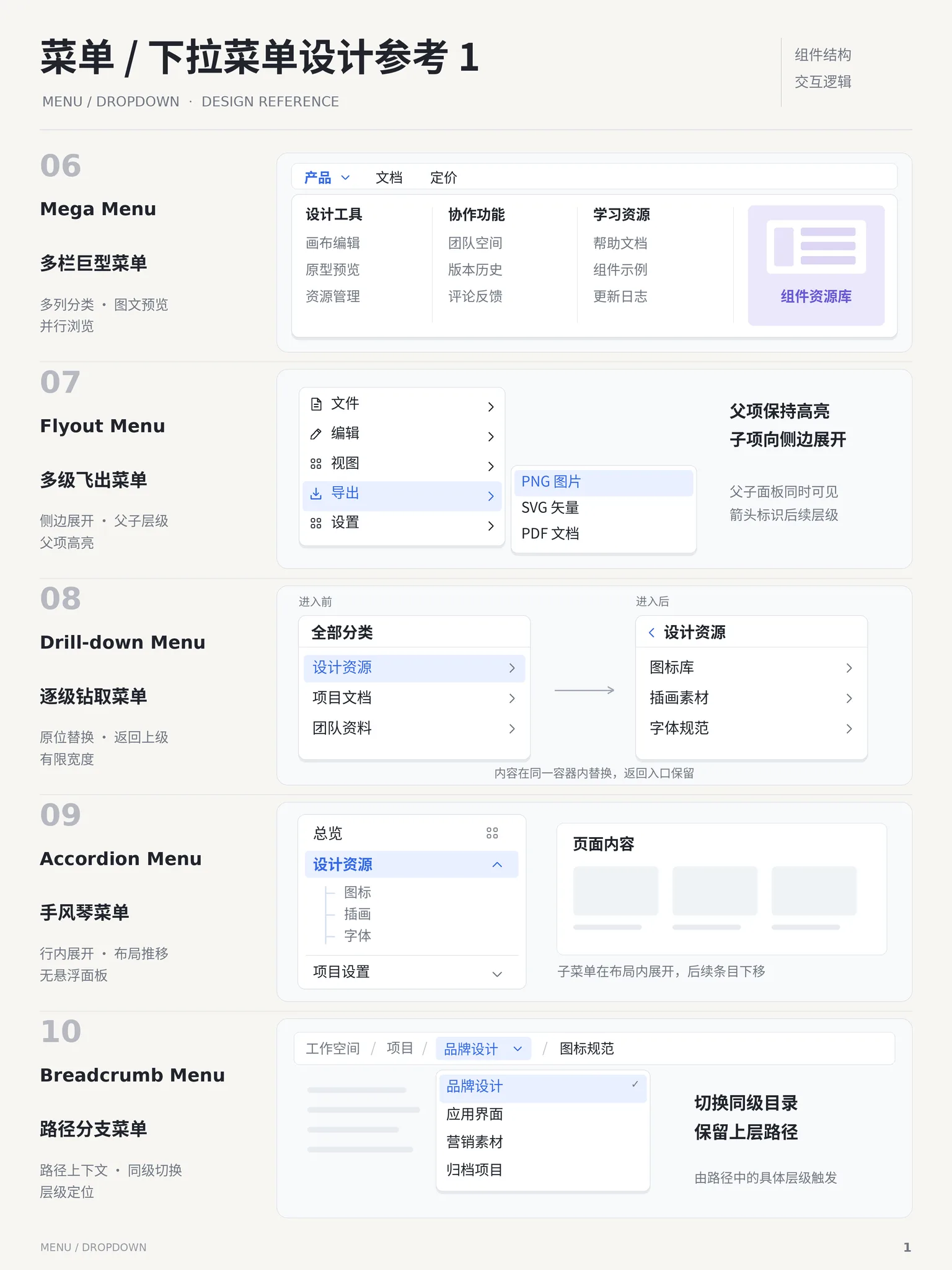
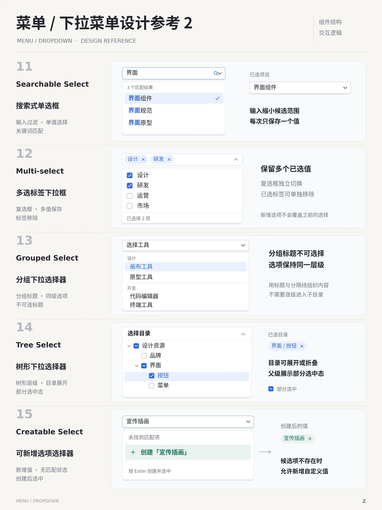
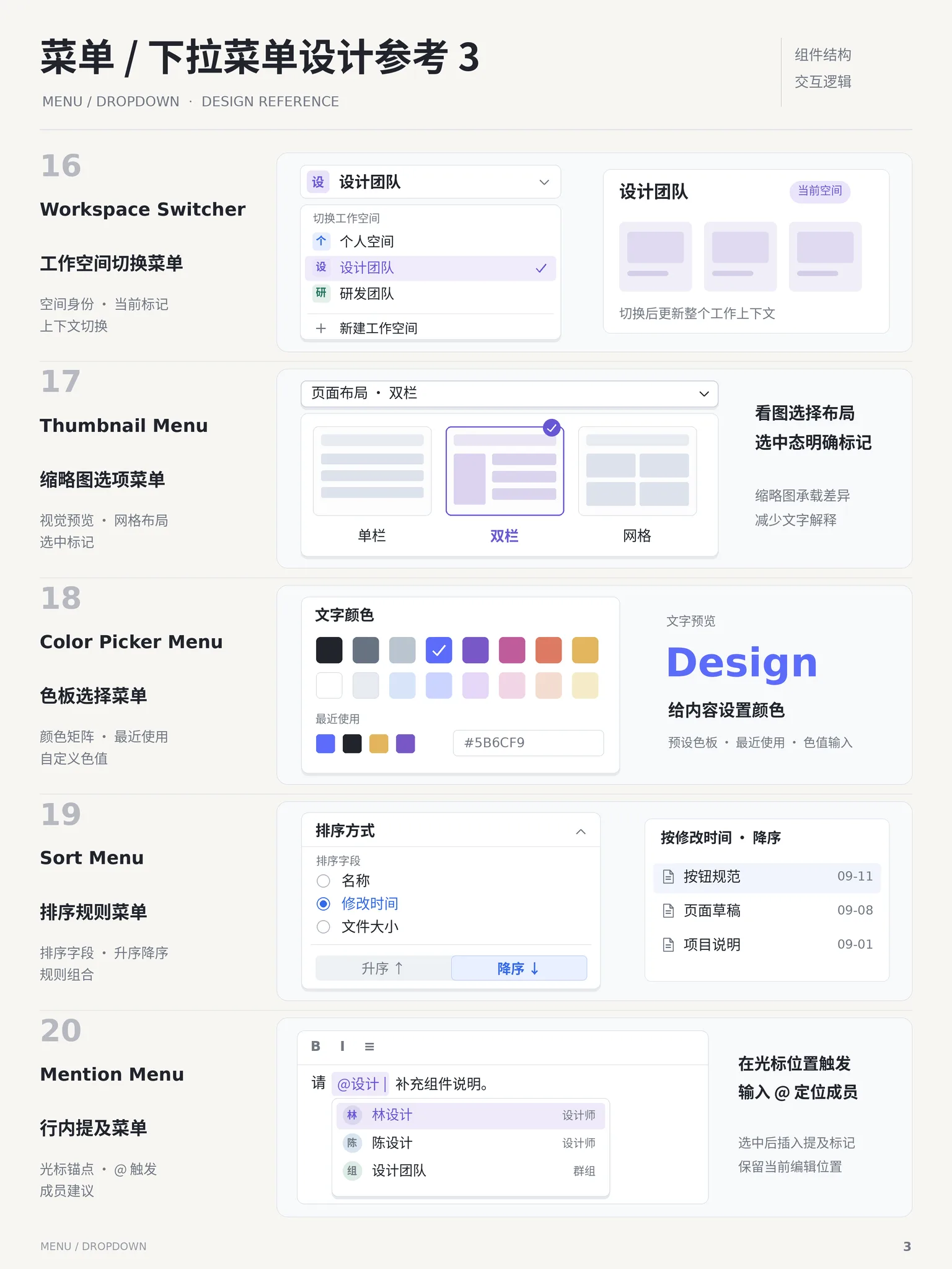
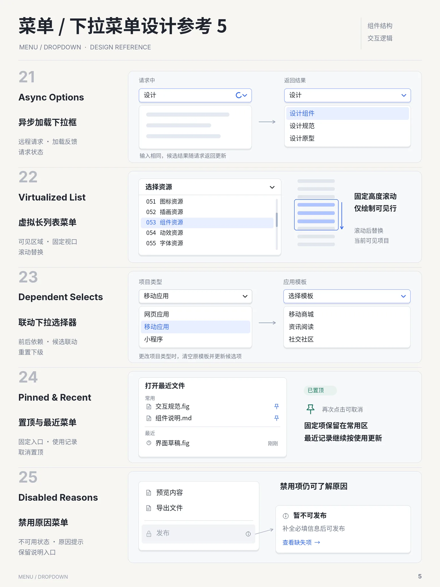
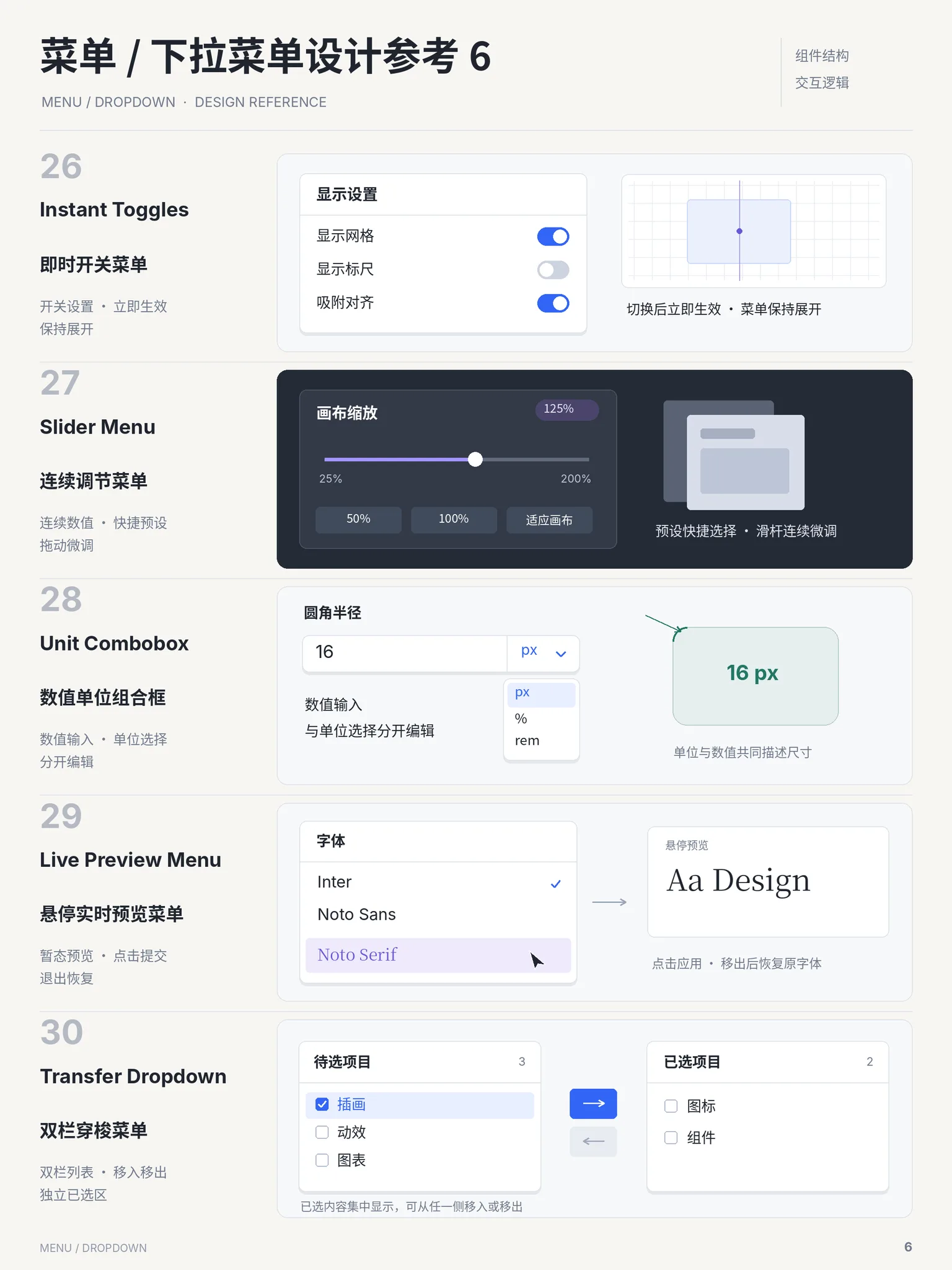
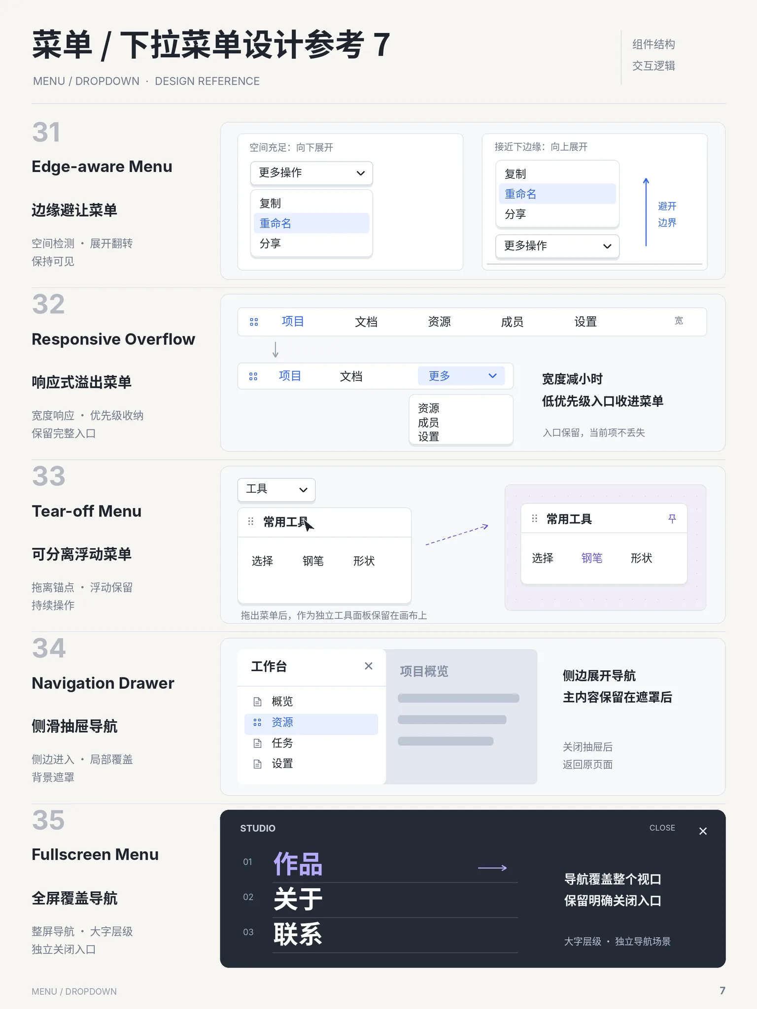
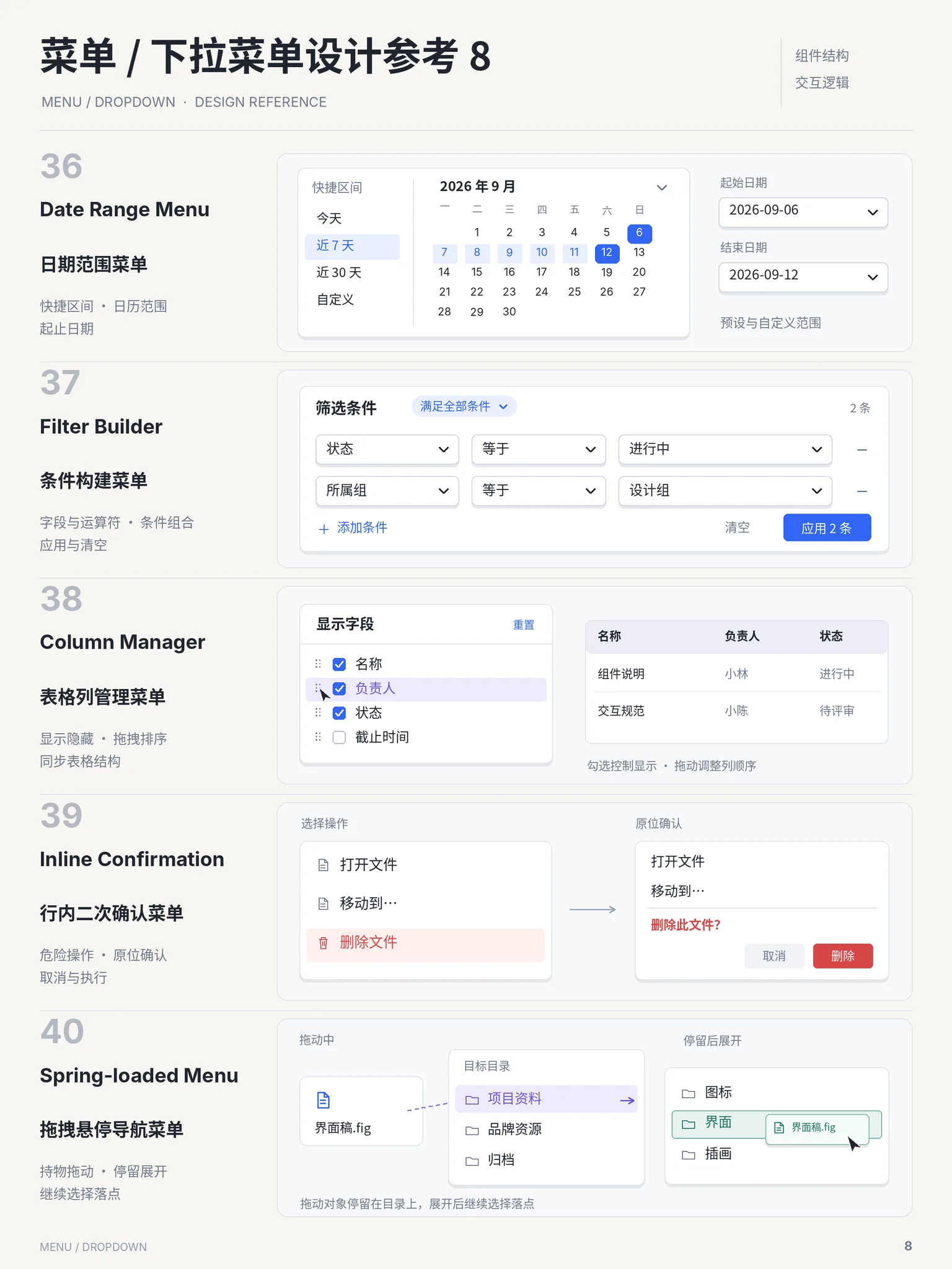
Eight AI-generated menu/dropdown reference posters. Each sheet explores five cases around "component structure + interaction logic": from plain action menus to grouped, nested, context and command menus — the full spectrum of triggers and hierarchy.
Image-generation prompt (reproducible)
A vertical "Menu / Dropdown Design Reference" poster, sheet number N. Off-white background (#FAF9F5), bold black Chinese title plus grey "MENU / DROPDOWN · DESIGN REFERENCE" subtitle, two small labels top right ("组件结构 / 交互逻辑"). Five numbered cases: large grey index, English pattern name (e.g. Action Menu, Grouped Menu, Nested Menu, Context Menu, Command Menu), Chinese name and a 2x2 keyword grid; on the right, a realistic menu demo — a trigger button with an open floating panel (items, icons, shortcut hints, separators, selected state) and a one-line caption. Strict grid, flat minimal, blue accent only, bilingual labels, crisp UI details.制作一张竖版「菜单 / 下拉菜单设计参考」海报,编号 N。米白背景(#FAF9F5),黑色粗标题 「菜单 / 下拉菜单设计参考 N」+ 灰色小字 MENU / DROPDOWN · DESIGN REFERENCE,右上角 两行小标签「组件结构 / 交互逻辑」。正文纵向排列 5 个案例,每条左侧是大号灰色序号 01~05、 英文模式名(如 Action Menu / Grouped Menu / Nested Menu / Context Menu / Command Menu)、中文模式名与 2×2 关键词短语;右侧浅灰圆角卡片内是真实感的菜单演示—— 触发按钮加展开的浮层面板(菜单项、图标、快捷键提示、分隔线、选中态),底部一行灰色说明。 排版网格严格、留白充足、扁平极简,蓝色仅作强调,中英文对照,UI 细节逼真。
- 💡 The twin labels keep every sheet covering both structure and behaviour
- 💡 For overlay components, demand the open state — otherwise you only get the trigger
Sheets (8)