Menu
菜单
Aliases:菜单下拉菜单右键菜单上下文菜单操作菜单更多操作三个点点出来的菜单
What is it
A temporary overlay listing actions, opened by click or right-click: flat or grouped command items that execute and close on selection. It houses infrequent actions (more, settings, delete), usually behind a "⋯" button or a context click.
Name disambiguation
A menu lists commands that run on click. Navigation (Navbar/Sidebar) lists destinations. A dropdown is the combined control — a button plus a menu.
Interactive playground
Try it. Make an informed choice.Try pointer and keyboard actions, rename, confirm deletion and undo.
Loading lab…
What to look for
- 01Every action, including destructive ones, must be keyboard reachable.
- 02Outside click and Escape should dismiss without losing focus.
From reference to practice
AI-generated visual references · Open the full collection
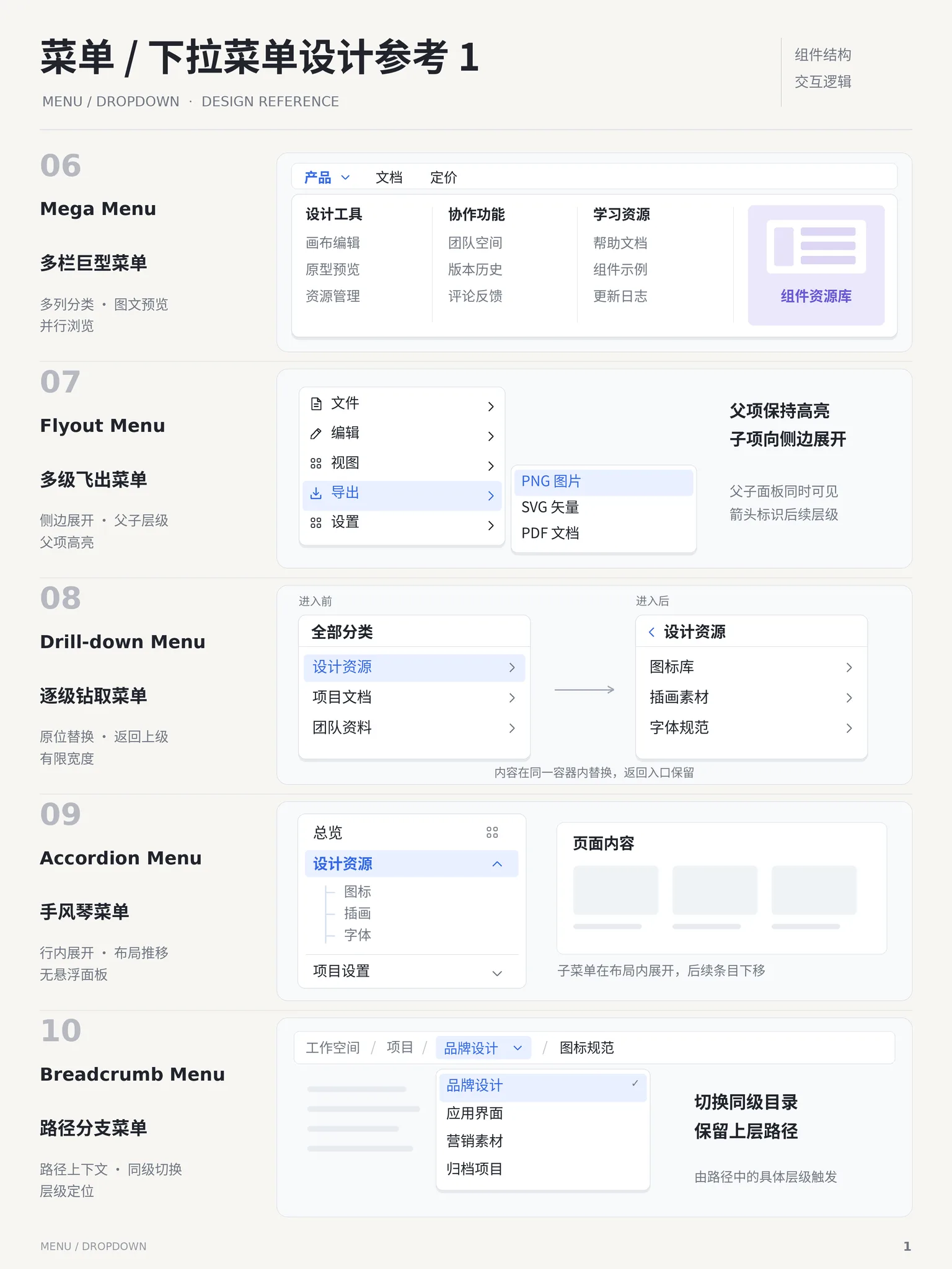
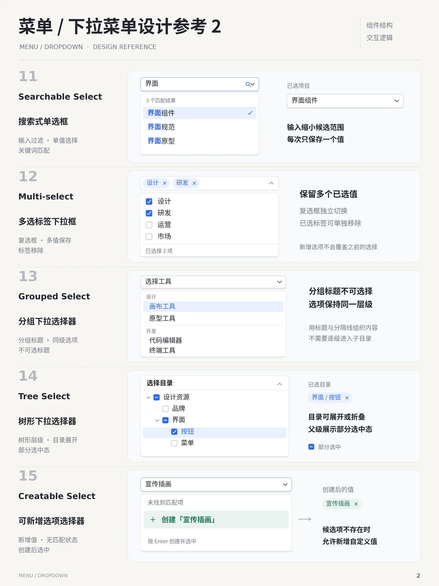
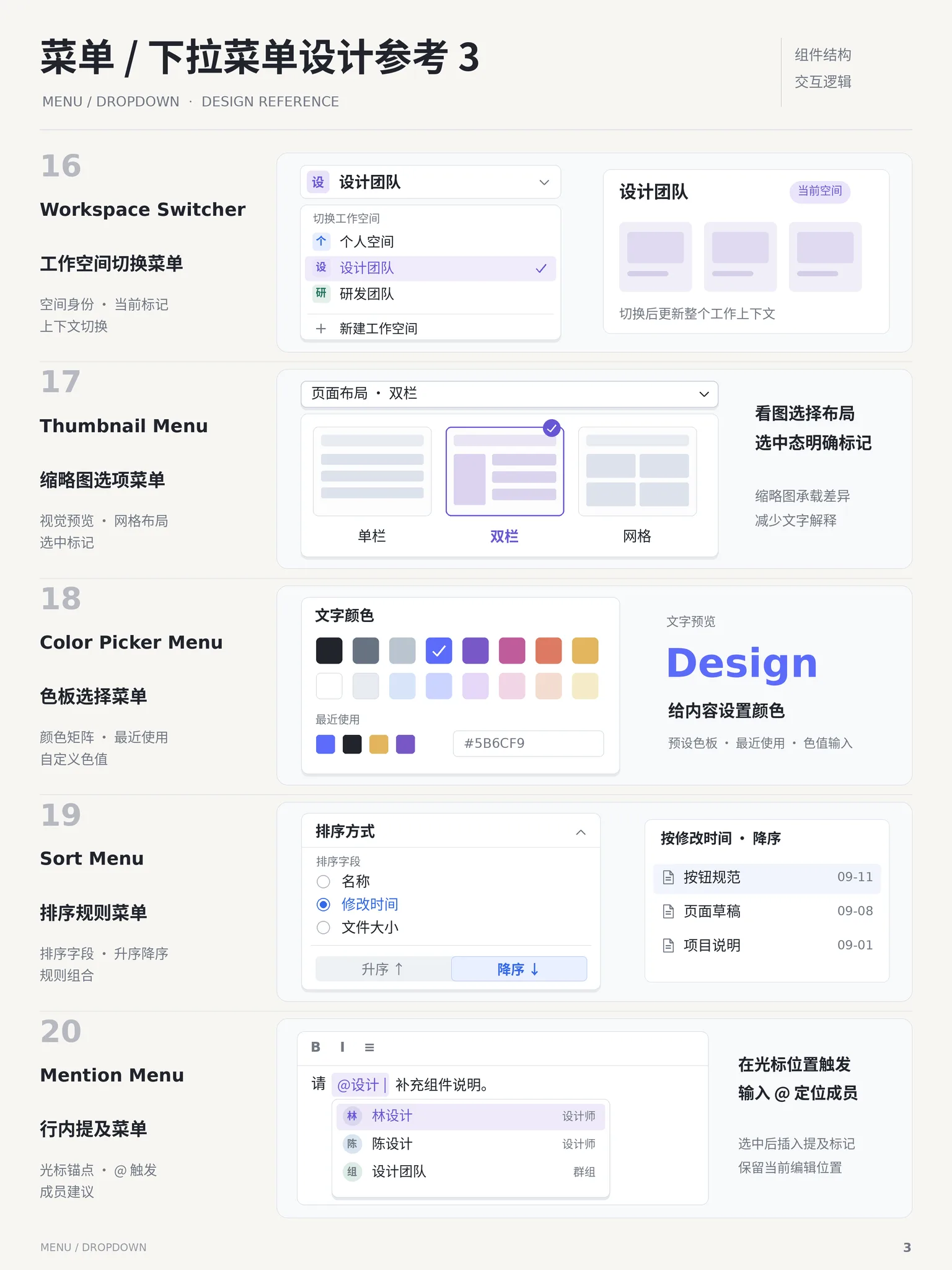
✓ When to use
- Stash infrequent actions instead of crowding buttons
- Context actions on right-click (files, canvas items)
- Site section entry points in a top nav
✕ When not to use
- Frequent primary actions — expose real buttons
- Very deep trees — use a sidebar or command palette
- Destructive items need confirmation, not one-click firing
Variants
Dropdown
下拉
Opens below its trigger button
Context
上下文
Opens at the pointer on right-click
Grouped
分组
Group labels with separators
Implementation
position: absolutez-indexbox-shadowmin-widthAnchor to the trigger with absolute positioning, opening below by default and flipping near screen edges. Items are buttons with role="menuitem"; ↑↓ cycles, Enter executes, Esc closes; destructive items get red text and a separator before them. Close on outside click: listen for pointerdown on document and check the target.
Platform API
role="menu"role="menuitem"Compare
Full comparison →| Menu菜单 | Navbar顶部导航栏 | Sidebar侧边栏 | |
|---|---|---|---|
| Space footprint | Low — hidden until invoked | Low — one top strip | High — persistent width |
| Layer capacity | Medium — two levels at most | Low — mostly one flat level | High — multi-level tree |
| Mobile friendly | Medium — needs larger touch targets | Medium — folds into a hamburger | Poor — becomes a drawer |
Related concepts
A menu of actions popping near its trigger to tuck away secondary operations and keep the interface tidy — the classic form being a "···" more button. The panel floats over content with a shadow; picking an item executes and closes, and destructive actions sit isolated below a divider in red.
ComponentsSimilarA horizontal navigation bar pinned to the top of the page: brand on the left, primary links in the middle, search, actions and avatar on the right. It is the front door of a site — the 3–7 most important destinations compressed into one strip, folding into a hamburger menu on mobile. Usually kept visible with position: sticky.
ComponentsAlternativeA floating search panel summoned with ⌘K / Ctrl+K: type to filter commands, pages or content, navigate with arrow keys, execute with Enter. Popularized by macOS Spotlight; now standard in power-user products.
ComponentsSimilarA non-modal layer that pops up beside its trigger on click, carrying medium-complex content such as text, a mini-form or a date picker. No backdrop and no blocking of the rest of the page; clicking outside or pressing Esc closes it.
ComponentsSimilarNot to be confused with
Dropdown is the full button+menu control; Menu is only the popup command list.
Navbar jumps to destinations; Menu runs immediate commands.
Select picks a value for a form; Menu triggers an action.