Navbar
顶部导航栏
Aliases:导航栏顶部菜单页面最上面那一条header 导航页头导航汉堡菜单那条栏top bar
What is it
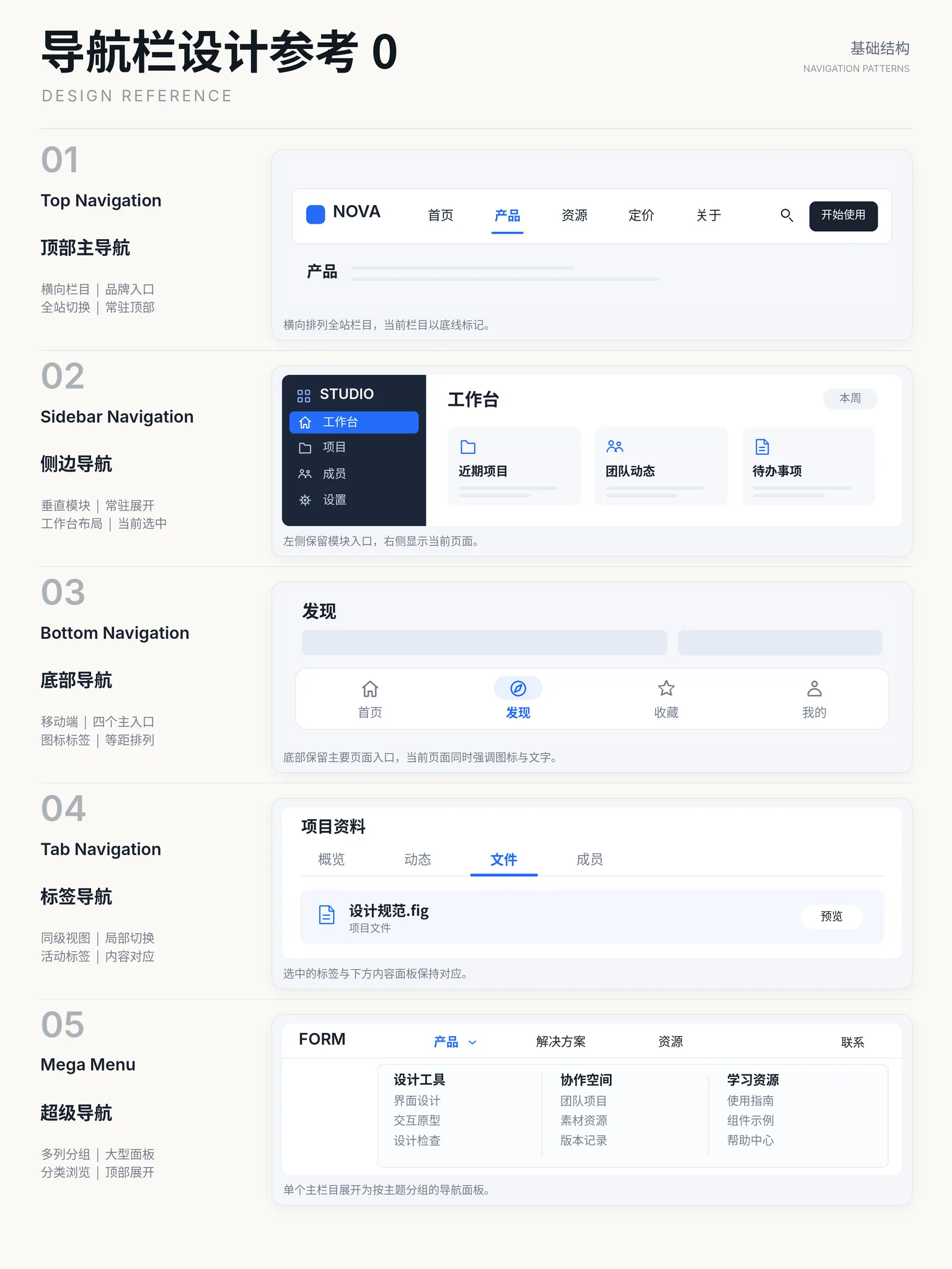
A horizontal navigation bar pinned to the top of the page: brand on the left, primary links in the middle, search, actions and avatar on the right. It is the front door of a site — the 3–7 most important destinations compressed into one strip, folding into a hamburger menu on mobile. Usually kept visible with position: sticky.
Interactive playground
Try it. Make an informed choice.Switch sections, expand navigation, search resources and try the primary action.
Loading lab…
What to look for
- 01The active section should agree with displayed content.
- 02Keep navigation discoverable in narrow layouts.
From reference to practice
AI-generated visual references · Open the full collection
✓ When to use
- Marketing, product and docs sites with few flat destinations
- Brand and global actions must stay pinned above the fold
- Vertically scrolling layouts that can spare one horizontal strip
✕ When not to use
- Deep admin hierarchies — prefer a sidebar
- Scanning many nav items at once
- Immersive reading or editor modes
Variants
Standard
标准
Brand left, links center, actions right
Centered
居中
Absolutely centered links, Apple-style
Transparent overlay
透明悬浮
Floats over the hero, gains a background on scroll
Floating container
悬浮容器
Place navigation in a rounded, outlined container with a subtle shadow.
Implementation
position: stickyz-indexflexjustify-content: space-betweenSticky top bar with a three-part flex row (brand / links / actions). Mark the current item with accent color or underline (aria-current="page"). Below the mobile breakpoint hide the links behind a hamburger that opens a dropdown or drawer; the overlay variant gains background and backdrop-filter after scrolling past the hero.
Platform API
<nav>role="navigation"Compare
Full comparison →| Navbar顶部导航栏 | Menu菜单 | Sidebar侧边栏 | |
|---|---|---|---|
| Space footprint | Low — one top strip | Low — hidden until invoked | High — persistent width |
| Layer capacity | Low — mostly one flat level | Medium — two levels at most | High — multi-level tree |
| Mobile friendly | Medium — folds into a hamburger | Medium — needs larger touch targets | Poor — becomes a drawer |
Related concepts
A vertical navigation area pinned to one side of the page (usually the left), carrying the primary hierarchy of a product. The de facto standard of admin systems: brand and global search on top, module tree in the sidebar, content focused on the task.
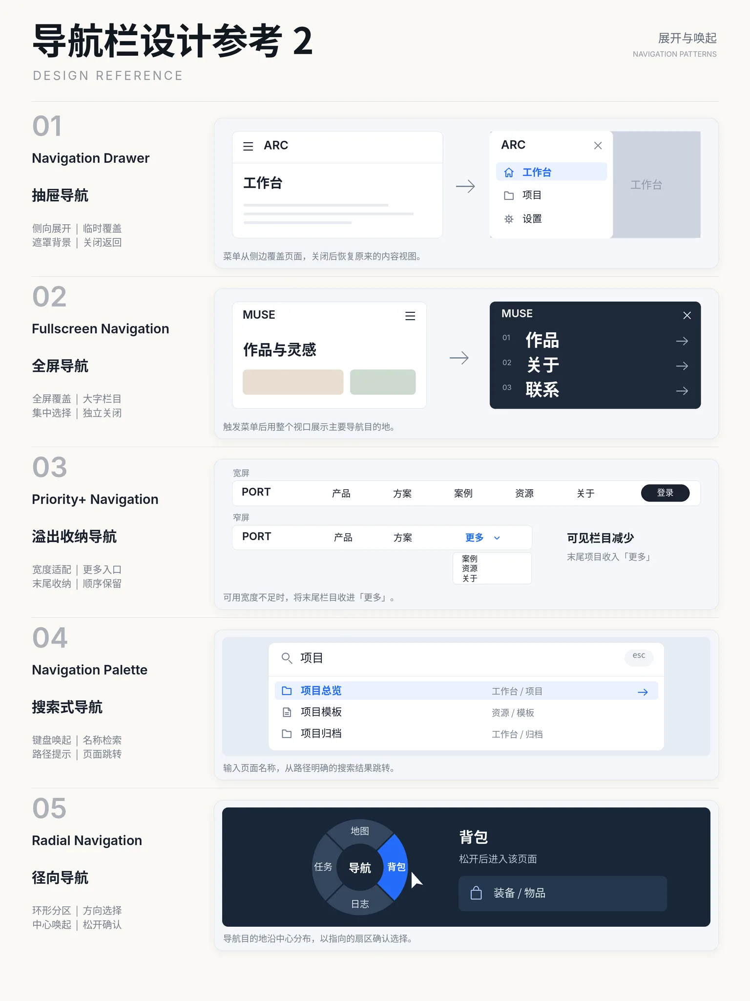
ComponentsAlternativeA temporary overlay listing actions, opened by click or right-click: flat or grouped command items that execute and close on selection. It houses infrequent actions (more, settings, delete), usually behind a "⋯" button or a context click.
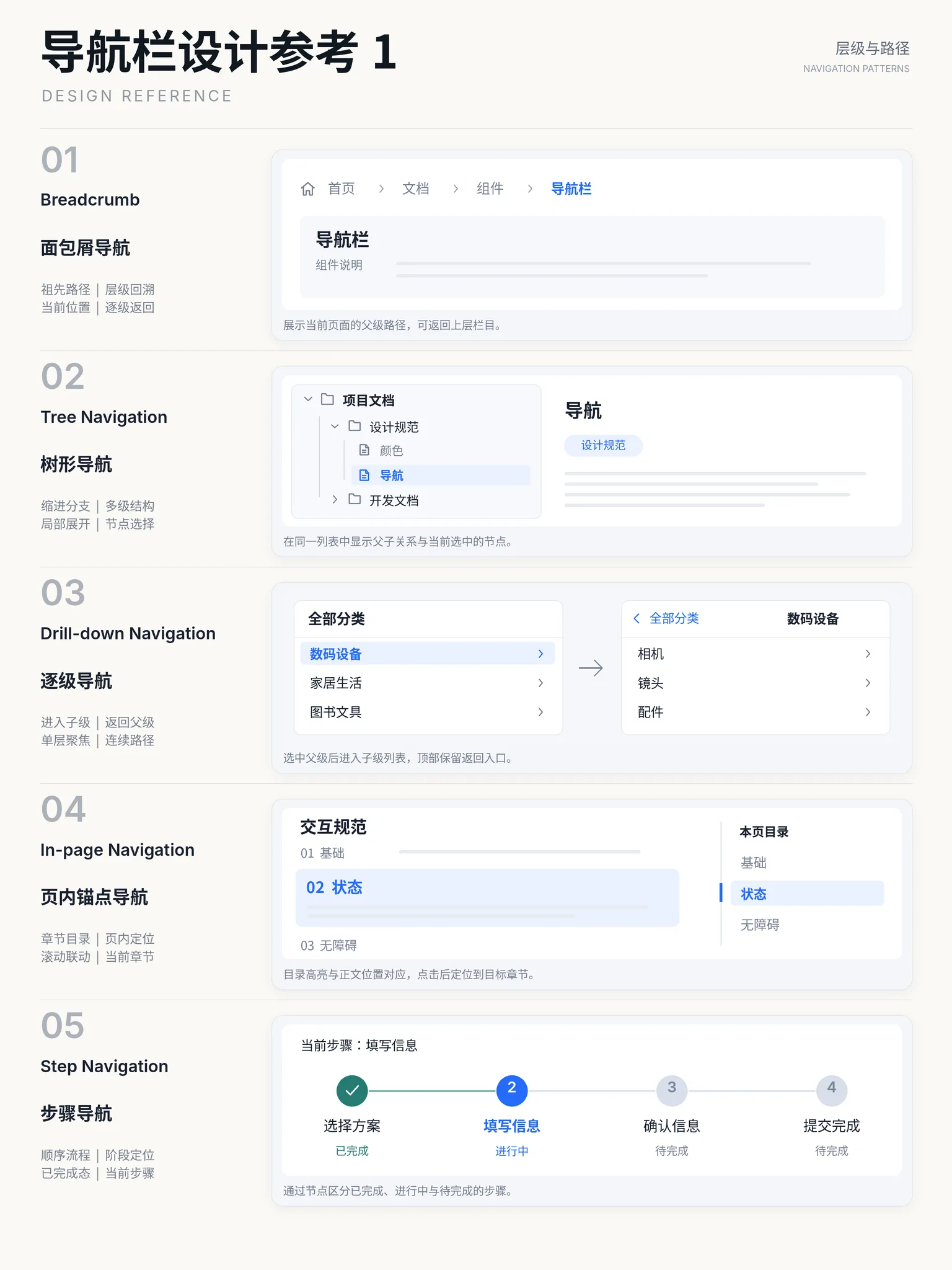
ComponentsAlternativeA hierarchical path like "Home / Library / Page" that states where the user sits in the information architecture: every ancestor is a link back, and the last item marks the current page. The cheapest way to keep users oriented — the name comes from the breadcrumbs Hansel dropped to find his way home. Usually placed above the page title.
ComponentsSimilarA row of switchable labels that divide one region into mutually exclusive views: the tab headers stay visible and clickable, and only the active tab's panel shows while the rest stay hidden. Packs several tightly related contents into one area to switch in place instead of full-page navigation. Arrow-key navigation between tabs makes it a classic accessibility showcase.
ComponentsSimilarA marketing page organized vertically around one conversion goal: nav and hero explain "what is this and why it's good", mid-sections use features and social proof (logos, testimonials, numbers) to dissolve objections, and a strong call-to-action closes. Sections follow the persuasion order — each screen answers the visitor's next question.
PagesUsed with