Tabs
标签页
Aliases:选项卡tab 切换页签切换标签浏览器那种标签分栏切换
What is it
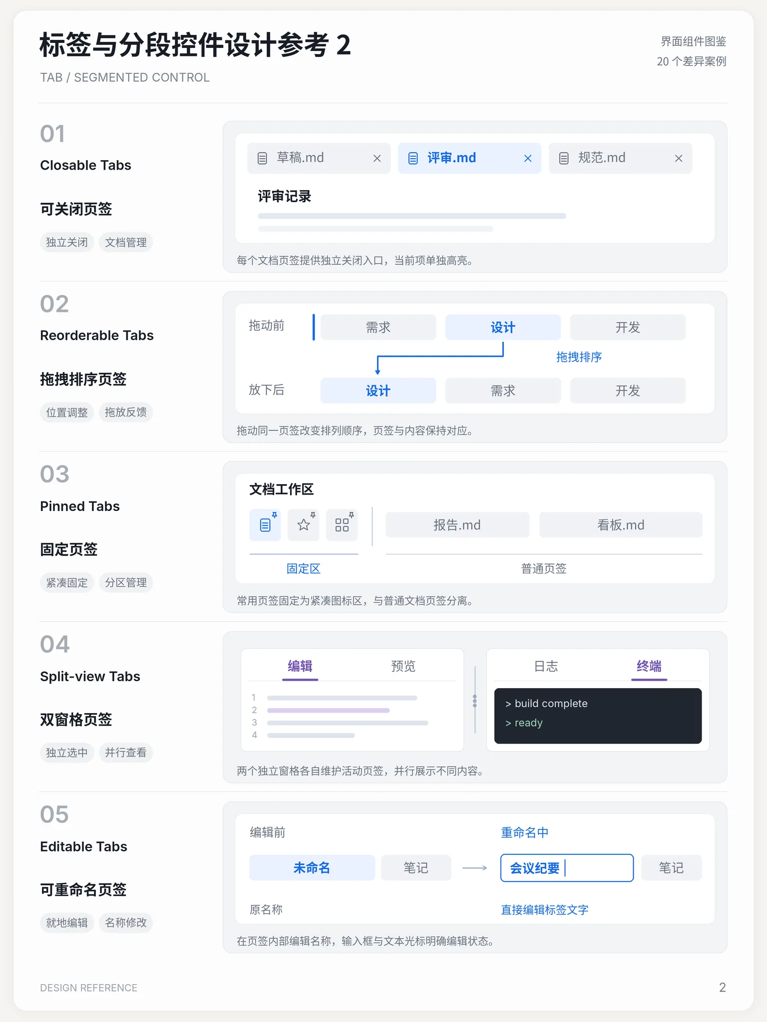
A row of switchable labels that divide one region into mutually exclusive views: the tab headers stay visible and clickable, and only the active tab's panel shows while the rest stay hidden. Packs several tightly related contents into one area to switch in place instead of full-page navigation. Arrow-key navigation between tabs makes it a classic accessibility showcase.
Name disambiguation
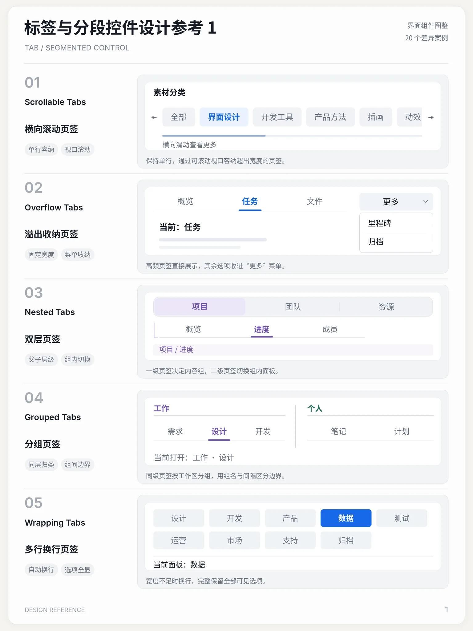
Tabs switch peer content panels. A segmented control is a compact mode/filter switch. A breadcrumb shows hierarchical location.
Interactive playground
Try it. Make an informed choice.Choose an appearance, then navigate panels with arrows, Home and End.
Loading lab…
What to look for
- 01Synchronize focus and selection; connect tabs to their panels.
- 02Switch related content within the same context rather than navigating away.
From reference to practice
AI-generated visual references · Open the full collection
✓ When to use
- Parallel views of one object — overview / activity / settings
- Switching in place instead of full-page navigation
- Tightly related contents with ≤ 7 tabs
✕ When not to use
- Unrelated contents — split into pages or routes
- Users must compare two panes side by side
- Sequential flows — use a stepper
Variants
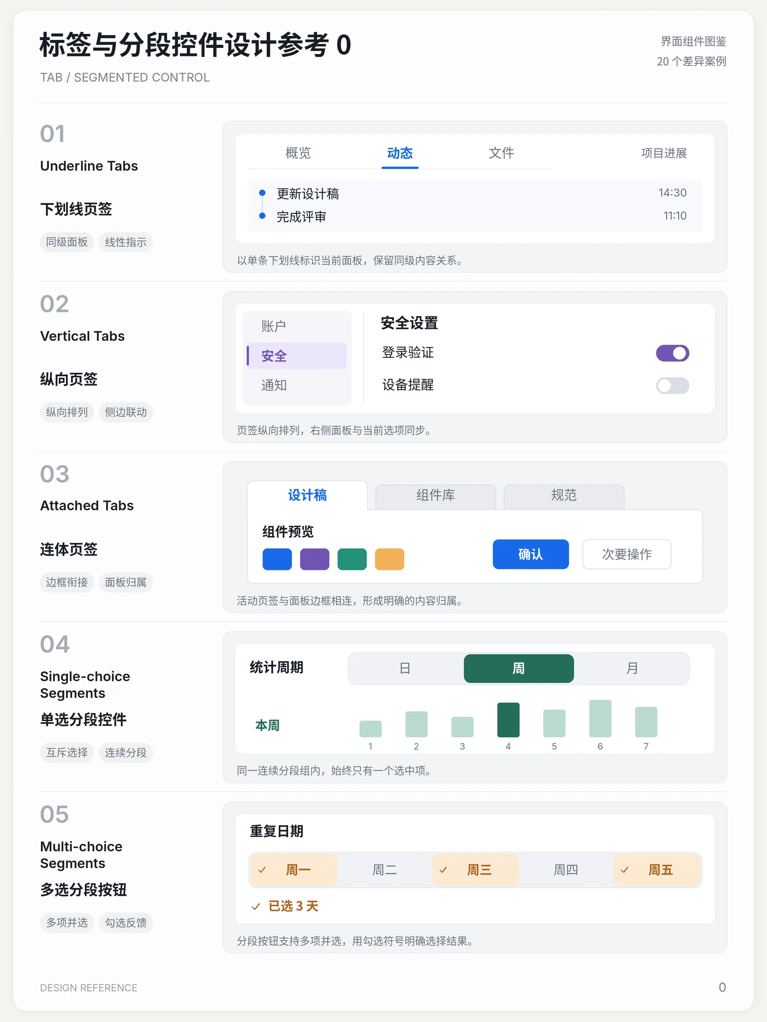
Underline
下划线式
Active marker under the label, Material-style
Pill / Segmented
胶囊分段式
Rounded segmented control, iOS-style
Card
卡片式
Tab cards fused with the panel
Implementation
flexborder-bottom: 2px solidtransformtransitionSemantics: role="tablist" > role="tab" (aria-selected) + role="tabpanel" (aria-labelledby, non-active panels hidden). Animate the active indicator with an absolutely positioned bar sliding via transform: translateX; panels may fade on switch. Keyboard support needs roving tabindex with arrow keys.
Platform API
role="tablist"role="tab"role="tabpanel"In code
The exact names this thing goes by in each ecosystem — use the row that matches your project.
Related concepts
A vertical list of collapsible sections: clicking a header expands its content and clicking again collapses it, either exclusively (one open at a time) or independently. Packs grouped content into limited space for on-demand expansion.
ComponentsSimilarA hierarchical path like "Home / Library / Page" that states where the user sits in the information architecture: every ancestor is a link back, and the last item marks the current page. The cheapest way to keep users oriented — the name comes from the breadcrumbs Hansel dropped to find his way home. Usually placed above the page title.
ComponentsSimilarA page-numbered control that slices long result sets into discrete pages: users explicitly click a page number or prev / next to fetch that slice, so the current position is always known, shareable and reversible. The controlled counterpart to infinite scrolling's endless drift — the default for search results and admin tables.
ComponentsSimilarA menu of actions popping near its trigger to tuck away secondary operations and keep the interface tidy — the classic form being a "···" more button. The panel floats over content with a shadow; picking an item executes and closes, and destructive actions sit isolated below a divider in red.
ComponentsSimilarA vertical navigation area pinned to one side of the page (usually the left), carrying the primary hierarchy of a product. The de facto standard of admin systems: brand and global search on top, module tree in the sidebar, content focused on the task.
ComponentsSimilarNot to be confused with
A segmented control is compact for modes/filters; tabs section content.
A breadcrumb shows hierarchy; tabs show peers.
A sidebar is persistent navigation; tabs are a strip inside content.