Brutalism
粗野主义
Aliases:粗野主义野兽派网页那种很糙的黑白网页超大字不修边幅原始网页风brutalismweb brutalismbrutalist web design
What is it
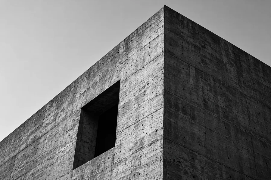
Raw structure, oversized type and blunt contrast as an anti-polish web look. Monochrome cuts, visible grids and hard square edges keep the honesty of default HTML. Information hits the reader straight on; radii, gradients and decorative refinement are refused.
Design spec
Typography
Ultra-bold sans or mono with cliff-edge size contrast
Color
Paper white, pure black and one harsh orange-red #FF3B00
Border
2px solid square edges, radius always 0
Shadow
No shadows; inverted blocks or thick strokes instead
Spacing
Hard cuts on the grid, whitespace in big blunt blocks
Motion
Near-instant, no transition
States
Hover inverts immediately; focus shows a 2px solid black frame; active switches to harsh orange-red #FF3B00; disabled drops to 50% grey; error uses a solid #FF3B00 block
Style in action
See the full page, then try the interactive sceneFull-page preview
GOOD
IDEAS
NO LIMITS.
We are an independent creative studio.
Brands, digital experiences, experiments.
Design beyond the expected.
DESIGN
FOR A MORE
OPEN WORLD.
IDEAS
PEOPLE
CULTURE
Interactive scene
Loading demo…
✓ When to use
- Designer portfolios, indie publishing and art institutions where attitude is the content
- Standing out among polished sites through deliberate unpolish
- Low-density manifesto or campaign pages where type is the poster
✕ When not to use
- Finance, healthcare and civic tools that must feel trustworthy
- Long forms and dense data backends — blunt contrast fatigues reading
- Brands that must feel refined, premium or caring
Variants
Classic brutalism
经典粗野
Monochrome cuts with one harsh accent, default-browser honesty kept
Soft brutalism
软粗野
Raw contrast and oversized type kept, radii and whitespace loosened
Typographic brutalism
排印粗野
Size, weight and leading carry everything — almost no graphics
Implementation
font-size: clamp(2.5rem, 8vw, 6rem)border-radius: 0border: 2px solid currentColorbackground-image: repeating-linear-gradient()font-family: system-ui, monospaceThe point is unpolish: radii stay 0, shadows are replaced by hard borders, type is system or monospace. A repeating-linear-gradient fakes the visible grid — no need for real CSS Grid. Keep exactly one harsh accent (classically #FF3B00); everything else is black and white. Dark mode inverts the value relationship but keeps the same blunt cuts. Never lower text contrast or scramble reading order just to look brutalist.
Agent prompts
Four prompt layers run from “what it is” all the way to a ready-to-run task. On the Agent task layer you can stack a visual style and extra requirements, then copy it to your coding agent in one click.
Implement Brutalism visual style in the current project.

Inspect the existing component system and design tokens first; reuse components and swap only the visual layer.
Requirements:
- Zero radii, no gradients, no soft shadows; hierarchy via thick strokes or inverted blocks
- Oversized clamp headings in system sans or monospace
- Visible background grid, exactly one harsh accent (#FF3B00), rest monochrome
- Buttons invert on hover; no bounce or lift
- Dark mode inverts values while keeping the blunt vocabulary
- Text contrast at 4.5:1 minimum; reading order never scrambled by decoration
- No new dependencies
Run existing project checks when done and list the modified files.

Additional requirements:
- Dark mode support
- Respect prefers-reduced-motion
- No new dependencies
- Run existing checks and list modified files
Hand to your coding agent — stack a style and extra requirements on top
Related concepts
A loud visual language of thick black outlines, saturated clashing colors and hard offset shadows: elements sit on the page like bold stickers, paired with chunky radii and punchy badges. It deliberately rejects polish and subtlety, trading refinement for instant recognition and a rebellious, playful voice.
StylesSimilarA visual language built on "less is more": generous whitespace, a restrained monochrome palette and very few type scales let the content speak. All decoration is stripped away; hierarchy is created purely by space, weight and rhythm. Quiet, restrained, content-first.
StylesAlternativeA visual language of objective grids and typography: strict mathematical grids, sans-serif faces, flush-left setting, black and white plus one accent (classically red). Order comes from whitespace and type scale. Decoration is noise; the goal is information read along the shortest path.
StylesSimilarA clickable block that triggers one clear action — the most basic interactive element of any interface. Fill, outline and ghost styles rank primary against secondary actions; presses give instant sink-in feedback, and a busy state disables further clicks to prevent double submission.
ComponentsAffectsA self-contained rectangular container outlined by rounded borders or a surface colour, aggregating related content: cover, title, excerpt and actions. The universal display unit of content feeds, dashboards and commerce lists.
ComponentsAffectsA horizontal navigation bar pinned to the top of the page: brand on the left, primary links in the middle, search, actions and avatar on the right. It is the front door of a site — the 3–7 most important destinations compressed into one strip, folding into a hamburger menu on mobile. Usually kept visible with position: sticky.
ComponentsAffectsNot to be confused with
Brutalism is raw, unstyled web in monochrome; neobrutalism is candy stickers with thick borders and hard shadows.