Skeuomorphism
拟物化
Aliases:拟物化拟物风格仿真质感设计苹果早期那种真皮缝线效果带纹理立体感的老式UI皮革木纹质感界面Realistic UISkeuomorphic Design
What is it
A visual language that borrows real-world materials and physical forms for digital controls: leather stitching, wood grain, brushed metal, glass gloss. Buttons look pressable, switches look like levers — highlights, shadows and bevels make "what it looks like" teach "how it works".
Design spec
Typography
System sans close to print
Color
Aluminium gradients with blue highlights
Border
Metal outlines with inner highlight lines
Shadow
Outer shadows plus inset highlights
Spacing
Padding mimics physical proportions
Motion
150–200ms pressed-feel transitions mimicking a physical rebound
States
Hover deepens the highlight; focus shows a visible blue glow outline; active presses via inset shadow; disabled lowers contrast; error uses a red highlight
Style in action
See the full page, then try the interactive sceneFull-page preview
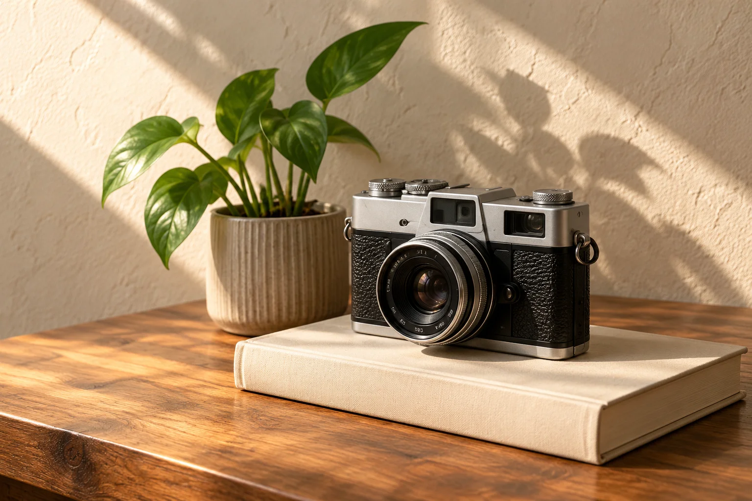
Good things.
A life well lived.
Honest materials. Objects with warmth.
Design that only gets better with time.
in the real details.
Interactive scene
Loading demo…
✓ When to use
- Unfamiliar users who learn controls from real-world metaphors
- Brands seeking vintage, nostalgic or crafted-premium feel
- Playful physical interactions — flipping, pressing, turning
✕ When not to use
- Dense productivity tools where decoration crowds out content
- Multi-platform products — heavy textures are costly to maintain
- Minimal brand contexts where skeuomorphism reads as dated
Variants
Leather
皮革缝线
Leather grain with stitching — early iOS Calendar and Notes
Brushed Metal
拉丝金属
Metal gradients with beveled highlights — classic iTunes
Paper
纸质
Paper corners and embossed type — the iBooks shelf
Implementation
background-image: url(texture)box-shadow: inset 0 1px 0linear-gradientborder-radiustext-shadowThree depth layers: a material base (texture image or a fine gradient), a 1px inset top highlight for the lit upper edge, and an outer bottom shadow for thickness. On press, flip the inset shadow to feel pushed in. Keep gradient bands narrow (3–8% luminance) or it reads as cheap plastic. Emboss text with a 1px dark shadow plus a 1px same-hue highlight. Dark mode darkens the material but keeps the highlight structure.
Agent prompts
Four prompt layers run from “what it is” all the way to a ready-to-run task. On the Agent task layer you can stack a visual style and extra requirements, then copy it to your coding agent in one click.
Implement dimensional skeuomorphic buttons and switches in the current project.

Inspect the existing design tokens first; express material parameters as configurable variables, not magic values.
Requirements:
- Buttons and switches with gradient + inset highlight + drop shadow, :active flips the inset shadow
- Materials as procedural gradients or inline SVG — no heavy texture assets
- Keyboard focus states and readable contrast
- Dark mode lowers material luminance but keeps the highlight structure
- Respect prefers-reduced-motion for any transitions
- No new dependencies
Run existing project checks when done and list the modified files.

Additional requirements:
- Dark mode support
- Respect prefers-reduced-motion
- No new dependencies
- Run existing checks and list modified files
Hand to your coding agent — stack a style and extra requirements on top
Related concepts
A visual language that expresses floating layers as frosted glass: a blurred backdrop (backdrop-filter), a low-opacity fill and a thin white rim of light. Panels literally reveal the vivid background beneath them, so the style is about depth — it only works over rich, colorful content worth revealing.
StylesSimilarA visual language that strips out all simulation: solid color blocks, simple geometry, no gradients, shadows or textures. Hierarchy comes from color, shape and typography alone. The opposite of skeuomorphism — the interface admits it is a glowing plane and trades decoration for clarity.
StylesSimilarThe future as imagined by the past: cream-orange-brown warm palettes, chunky rounded casings, orbit lines and planet decals, pixel screens and CRT phosphor — optimistic tech that has aged. Space-age dashboards, vintage appliances and space-race posters fold into one warm nostalgic future.
StylesSimilarA clickable block that triggers one clear action — the most basic interactive element of any interface. Fill, outline and ghost styles rank primary against secondary actions; presses give instant sink-in feedback, and a busy state disables further clicks to prevent double submission.
ComponentsAffectsA thumb sliding on a track represents a binary setting that takes effect immediately, no confirmation needed. Thumb travel and track color change together signal the state, with an on/off text hint beside or inside — the standard control of settings pages.
ComponentsAffects