Input Reference Sheets
输入框参考图集
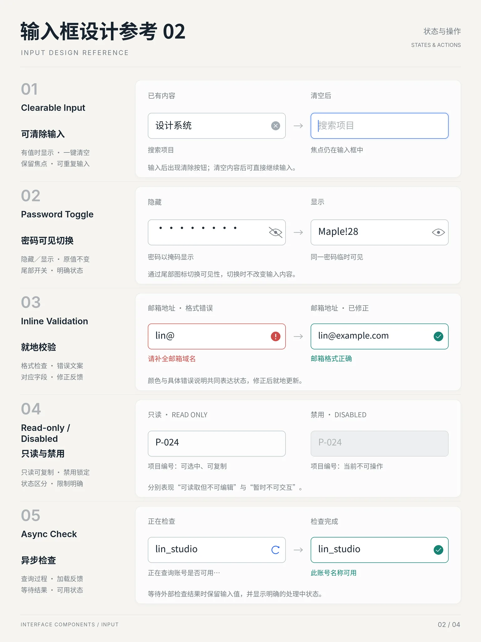
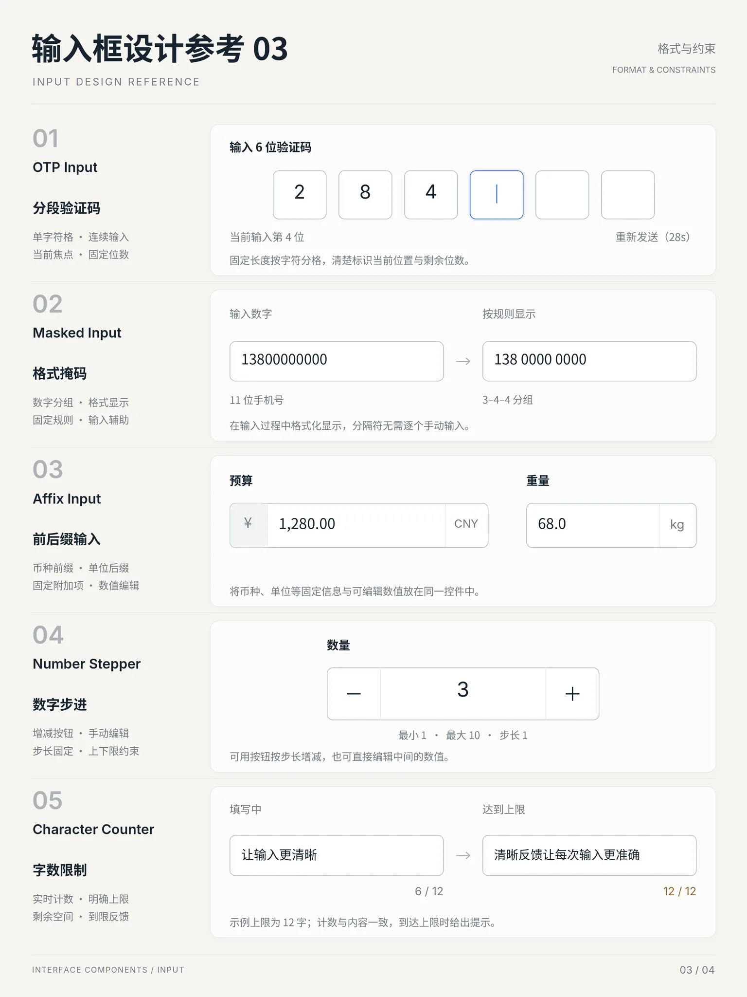
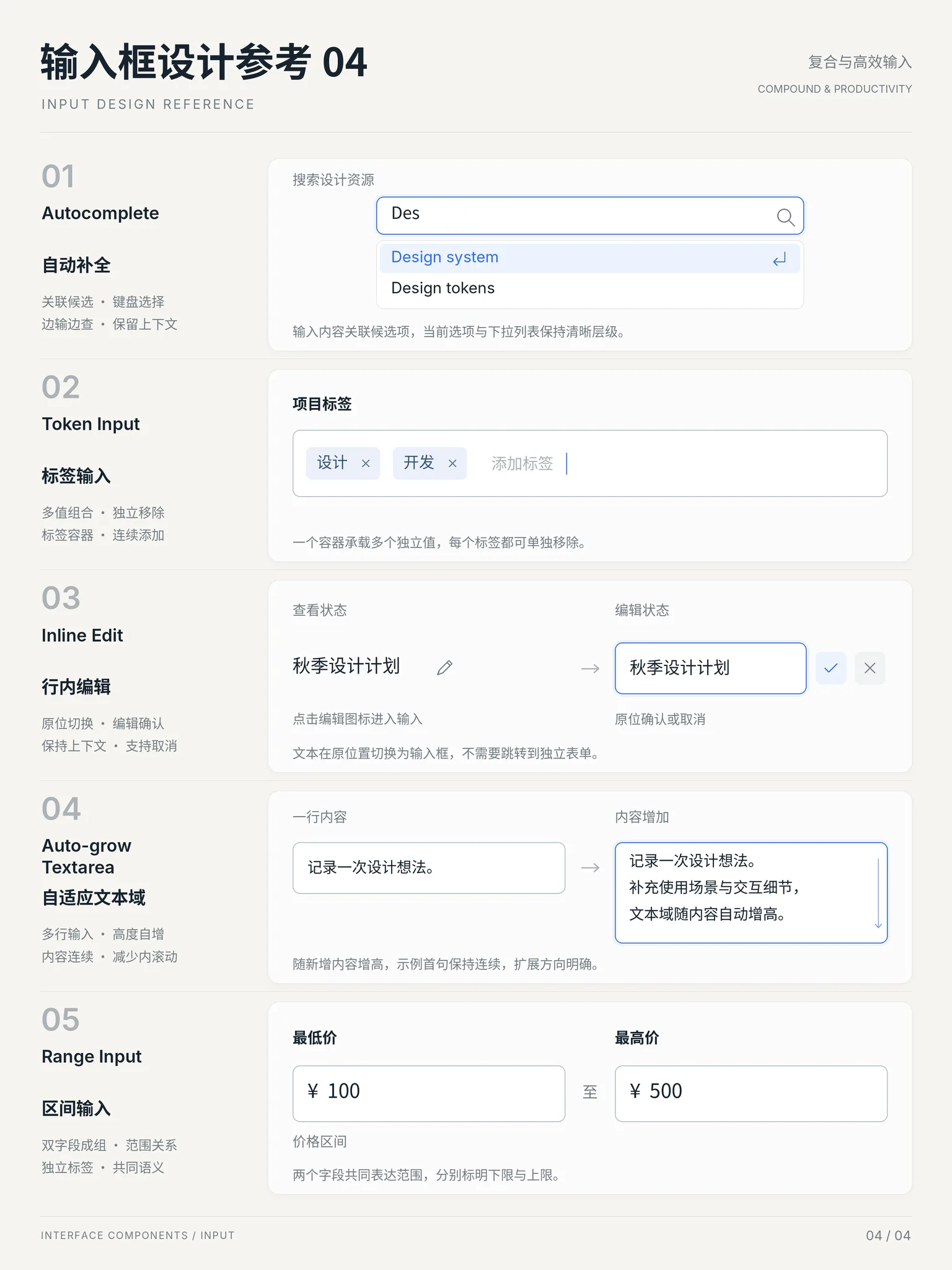
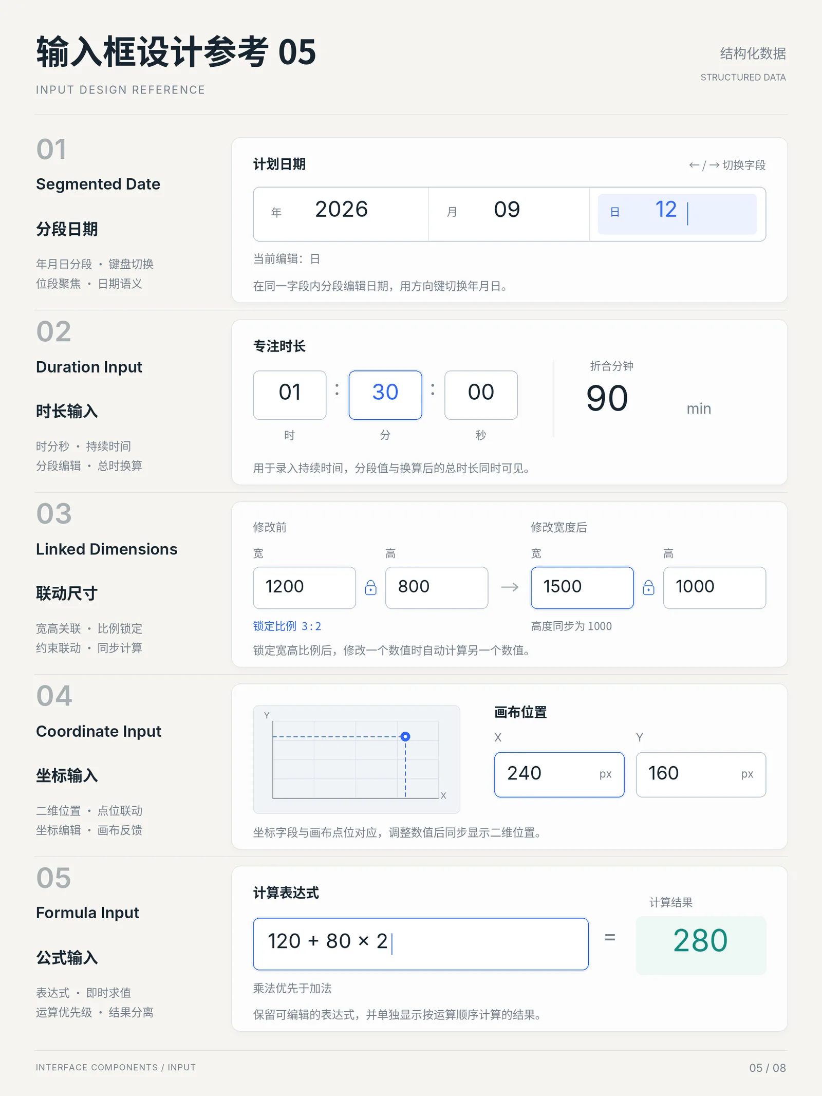
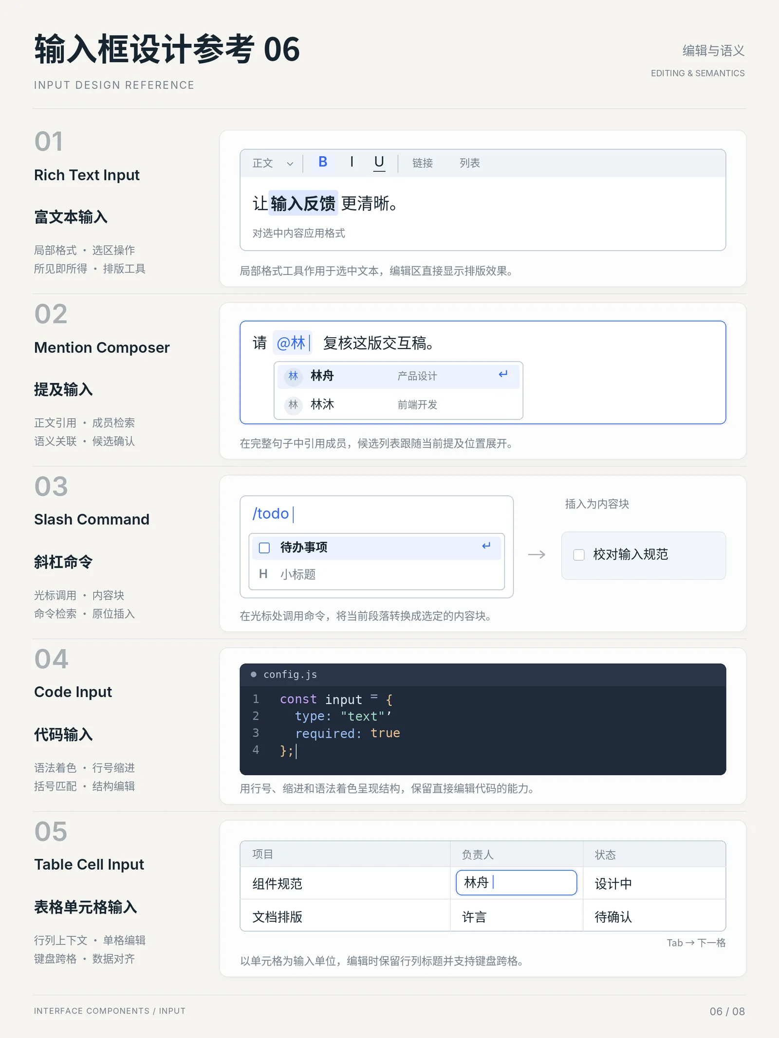
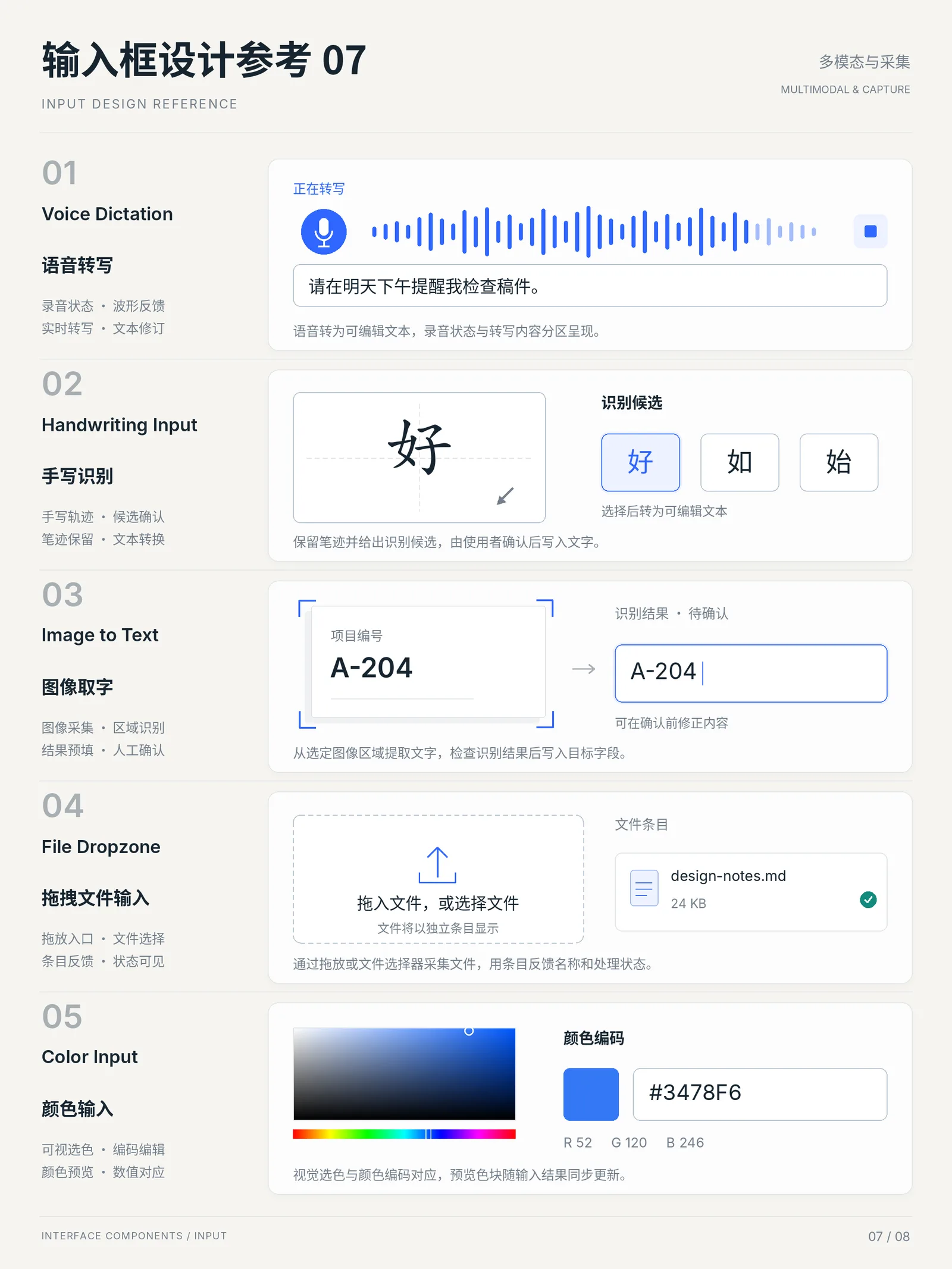
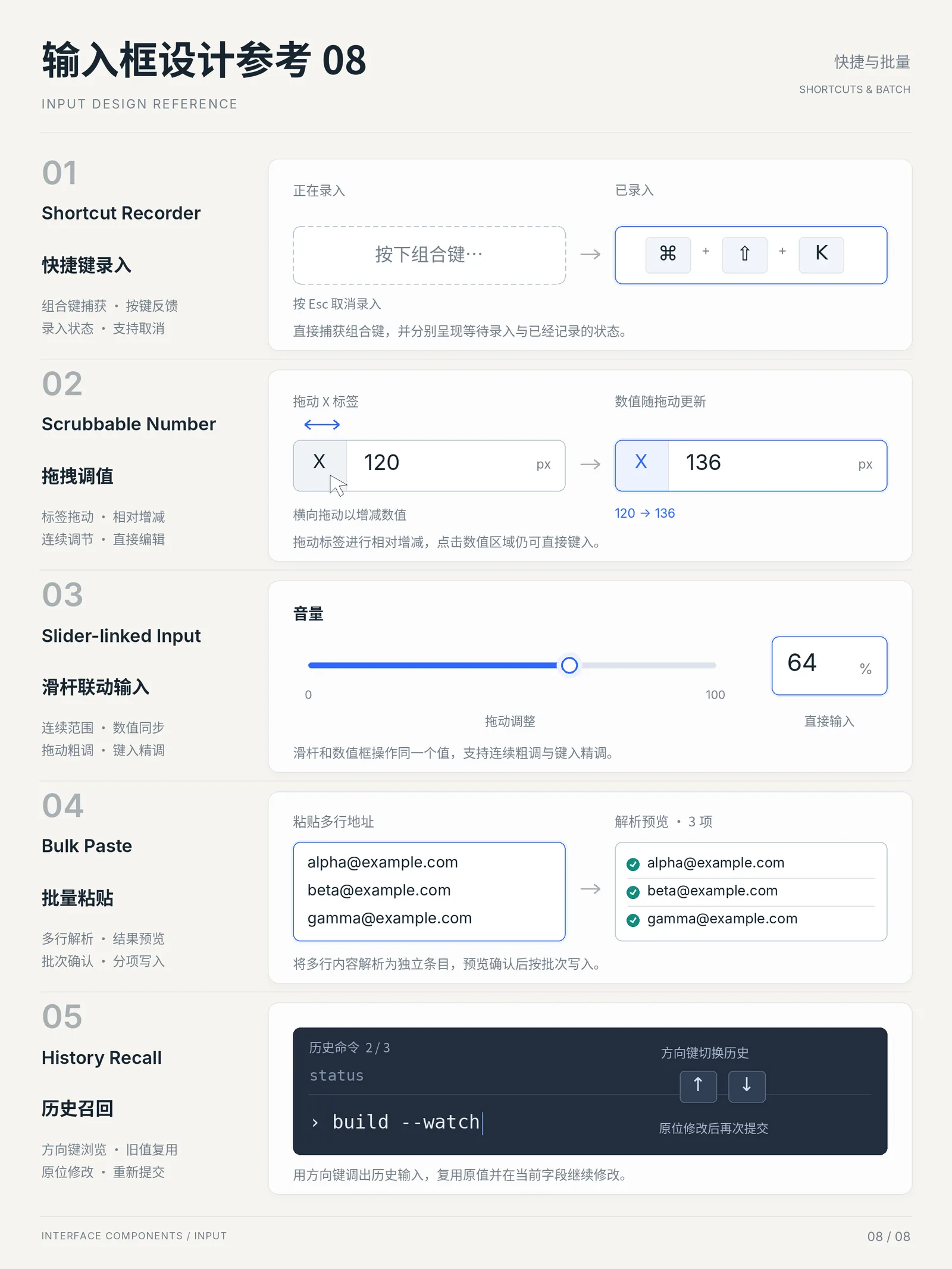
Eight AI-generated input-field reference posters: basic structure, states and actions, format constraints, then OTP fields, input masking, affixes, steppers, character counters, segmented dates, rich text, voice dictation and shortcut recording — every shape an input can take, in one sweep.
Observe → understand → borrow
What to borrow: three label placements
Choose a number to locate a detail in the original image. This is an AI-generated static reference; the notes distinguish visible structure from behavior that still needs implementation.
Annotation 1 · Original row 01
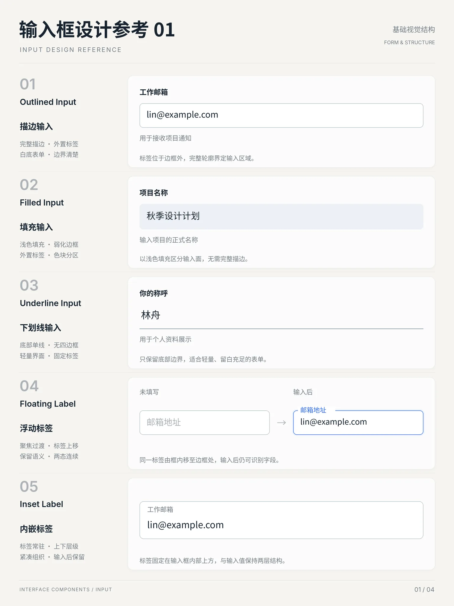
Separate the label, value, and helper text
- What is visible
- In row 01, the work-email label sits above the outline, the email value is inside the white field, and the notification helper text is below. All three remain close to the same field.
- What to borrow
- Borrow the persistent label and nearby helper text for profile or sign-up forms that users need to review. Associate the label with the input and expose helper text to screen readers.
- What not to copy blindly
- Do not treat the faint text and thin outline as validated production specifications. Error, required, and keyboard-focus states are not shown; implement and check them in a real page.
Annotation 2 · Original row 04
Keep the field name visible after entry
- What is visible
- Row 04 pairs an empty and a filled state. The email label starts inside the left field; on the right it sits on the top outline while the value stays inside. An arrow relates these two static states.
- What to borrow
- Borrow the principle that a filled field remains identifiable. If using floating labels, cover autofill, prefilled values, clearing, and focus; check enlarged text and long labels for overlap.
- What not to copy blindly
- Do not imitate this with a disappearing placeholder alone. Prefer a persistent external label when long names, large text, or dense forms leave insufficient space. The arrow does not demonstrate working animation or focus behavior.
Annotation 3 · Original row 05
Preserve hierarchy inside the field
- What is visible
- In row 05, a smaller work-email label sits above the larger email value within one outlined container. The label and the value occupy separate vertical space.
- What to borrow
- Borrow the two-level grouping for compact profile screens that need to show both field names and values. Reserve real height for both lines and keep the label semantically associated.
- What not to copy blindly
- Do not compress it into a fixed short height or make the label editable content. Long email addresses, wrapping labels, 200% text zoom, and multilingual pages need more room; this poster does not validate those cases.
Implementation guidance: W3C WAI · Labeling controls · Form instructions
Try real interactions in the input lab →Image-generation prompt (reproducible)
A vertical "Input Design Reference" poster, sheet number NN, with the sheet theme top right (e.g. Form & Structure / States & Actions / Format & Constraints). Off-white background (#FAF9F5), bold black Chinese title plus grey "INPUT DESIGN REFERENCE" subtitle. Five numbered rows: large grey index, English pattern name (e.g. OTP Input, Masked Input, Affix Input, Number Stepper, Character Counter), Chinese name and a 2x2 keyword grid on the left; a realistic demo of that input mode inside a light-grey rounded card on the right (six OTP boxes, a 3-4-4 grouped phone number, a ¥-prefixed and kg-suffixed field, a +/- stepper, a 6/12 character counter), with a one-line grey caption. Strict grid, flat minimal, blue accent only, bilingual labels, crisp UI details.
制作一张竖版「输入框设计参考」海报,编号 NN,右上角标注本张主题(如 基础视觉结构 / 状态与操作 / 格式与约束)。米白背景(#FAF9F5),黑色粗标题「输入框设计参考 NN」+ 灰色小字 INPUT DESIGN REFERENCE。正文纵向排列 5 个条目,每条左侧是大号灰色序号 01~05、 英文模式名(如 OTP Input / Masked Input / Affix Input / Number Stepper / Character Counter)、中文模式名与 2×2 关键词短语;右侧浅灰圆角卡片内是该输入模式的真实感演示 (如 6 格验证码、手机号 3-4-4 分组、¥ 前缀与 kg 后缀、加减步进器、6/12 字数计数), 卡片底部一行灰色说明。排版网格严格、留白充足、扁平极简,蓝色仅作强调, 中英文对照,UI 细节逼真。
- 💡 The theme line steers the sheet — swap it to target a specific input family
- 💡 Ask explicitly for interactive states, or every field comes back in its default state
Sheets (8)