Input
输入框
Aliases:输入框文本输入框文本框输入栏表单输入框单行输入框
What is it
A single-line bordered field for collecting text — the basic unit of every form. Placeholder hints the expected format, focus highlights the border to guide the eye, and failed validation switches to an error color with a hint. Prefix and suffix icons or a clear button can live inside, and the value is controlled state.
Interactive playground
Try it. Make an informed choice.Edit the email, switch appearance, clear it, try an invalid value and save.
Loading lab…
What to look for
- 01Placeholders are not labels; errors must explain the fix.
- 02Keep focus in the field after clearing.
From reference to practice
AI-generated visual references · Open the full collection
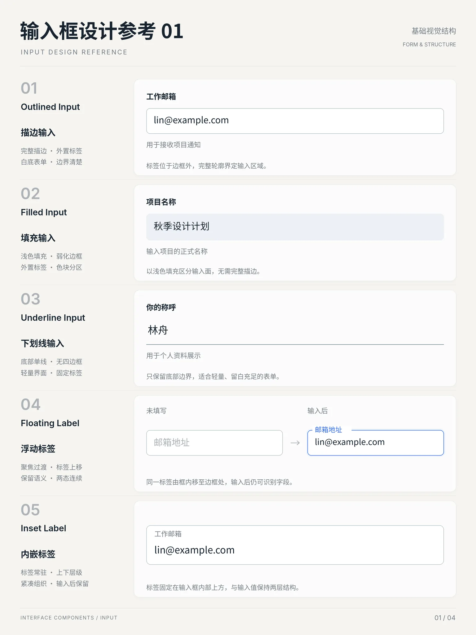
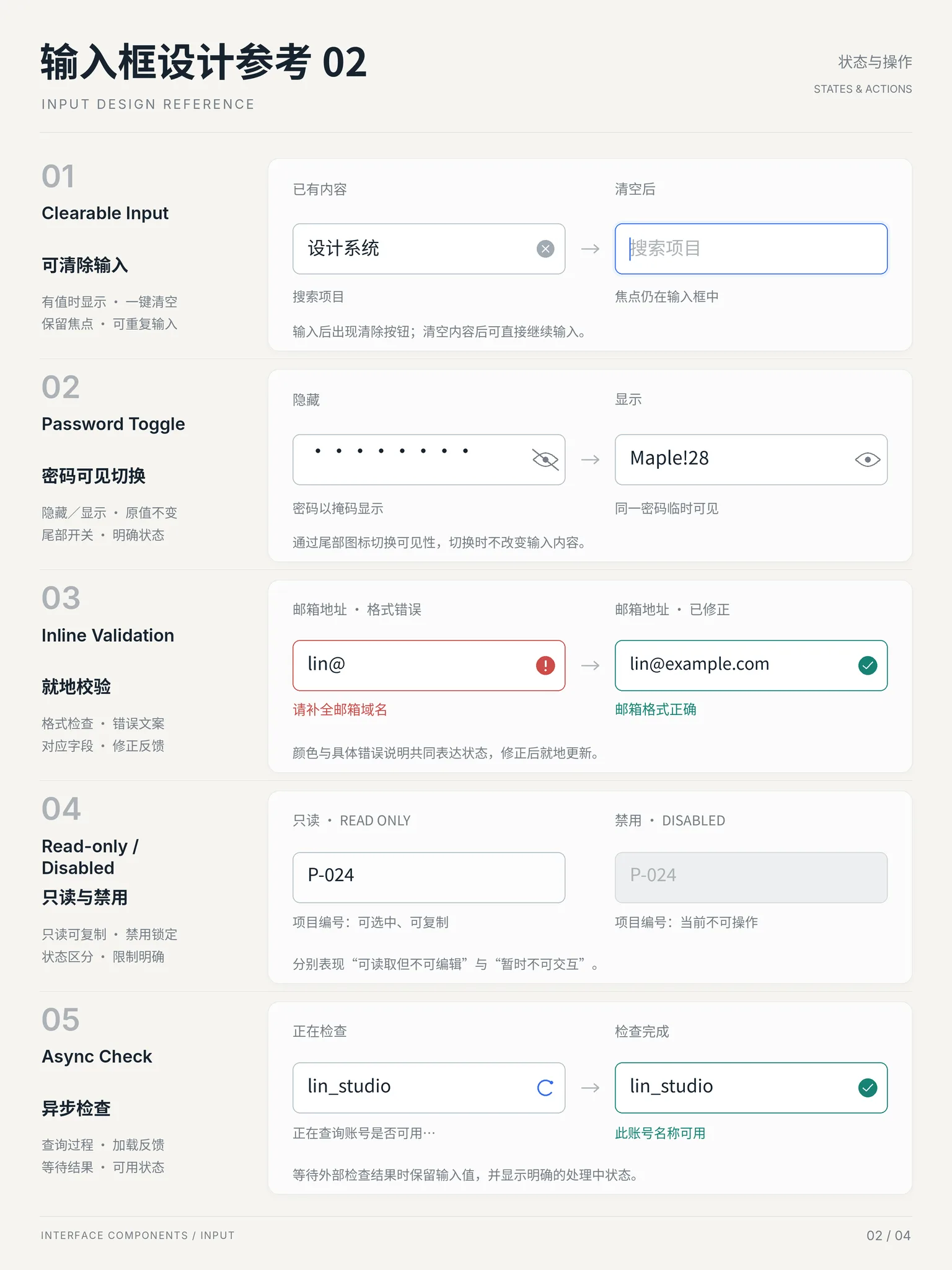
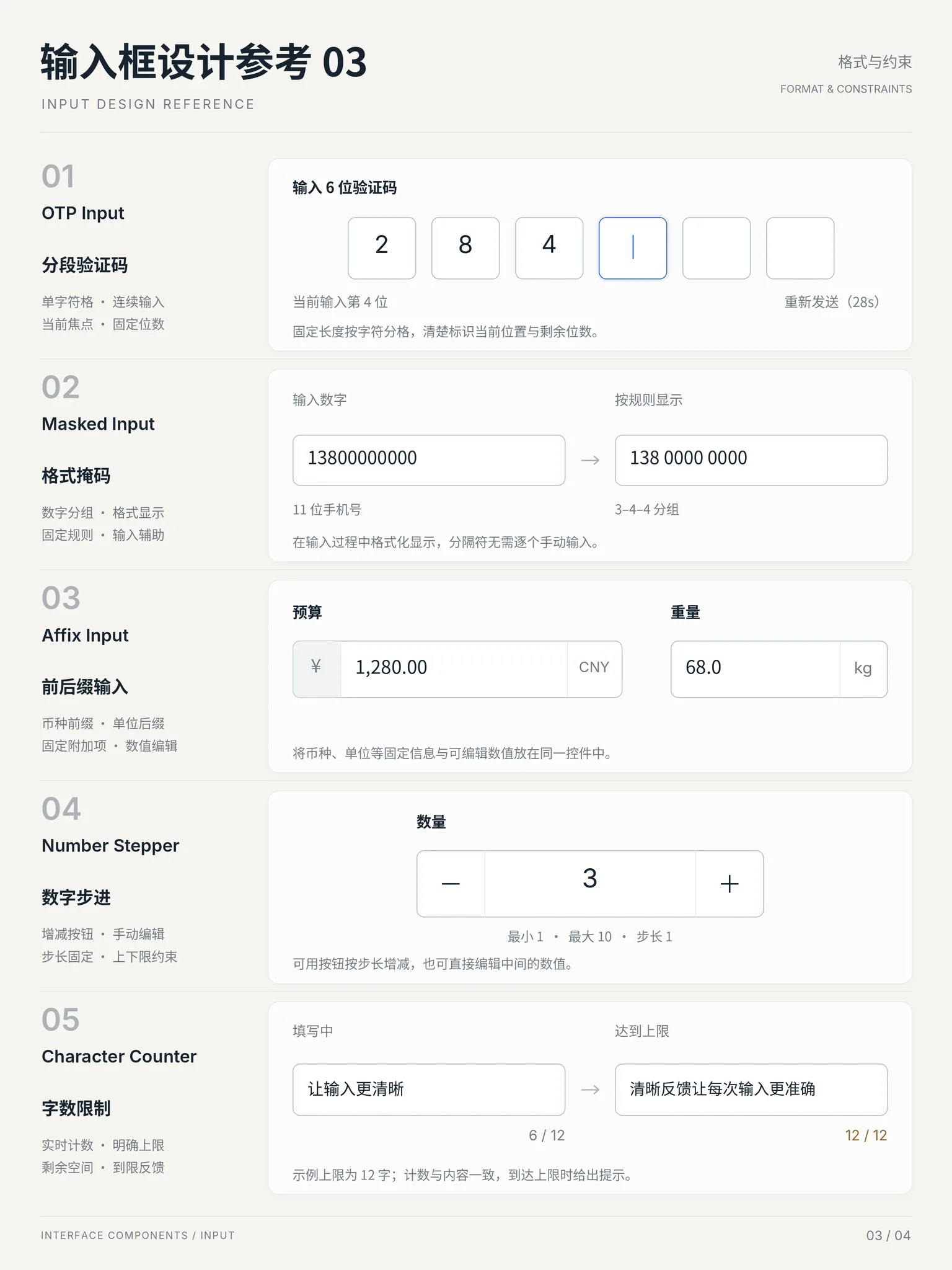
✓ When to use
- Short single-line values like name, email or title
- Forms that need instant validation feedback
- Search-like fields with icons or a clear button
✕ When not to use
- Multi-line content like bios — use a textarea
- Fewer than 5 fixed options — radio or select is faster
- Complex formats like rich text or dates — use dedicated components
Variants
Outline
描边
Bordered box — the default everywhere
Filled
填充
Tinted background, borderless — Material style
With addons
带前后缀
Inline icons and a clear button
Underline
下划线
Keep only the bottom rule with no radius or fill; the label stays visible.
Implementation
borderoutlinebox-shadow: ringtransitionBase style is border + rounded + horizontal padding; focus adds an accent ring via box-shadow without shifting layout; the error state swaps border and hint colors. The clear button is absolutely positioned inside. Keep height 36–44px, low-contrast placeholder, and always attach a label or aria-label.
Platform API
<input>typerole="textbox"In code
The exact names this thing goes by in each ecosystem — use the row that matches your project.
Related concepts
A growing multi-line field for long text — bios, notes, messages and feedback. It grows manually or automatically, usually paired with a counter and submit button; the count turns red past the limit and content wraps instead of clipping.
ComponentsSimilarA collapsed single-line control holding a set of mutually exclusive options; expanding the panel reveals them and the chosen value stays on the trigger. More space-efficient than radios, suited to more than 5 options; the panel can scroll, group or search, and picking one closes it.
ComponentsSimilarChecks input validity during typing or at submit and surfaces errors right next to the offending field. The goal is to tell users, with minimal interruption and maximum locality, what went wrong and how to fix it — instead of bouncing them back with a page of errors after submit.
PatternsUsed withNarrows a large list to whatever matches the current input: every keystroke filters the list in place, with hit counts and an empty-state hint. Finding becomes pruning — no submit, no page jump, feedback stays right in front of the user.
PatternsUsed with